About Project
Teammate Research Team | My Role UX Researcher, Interaction Designer | Duration 2.5 months
This study helps The Metropolitan Museum of Art, the largest art museum in the United States, improves the experience of visit planning and research on history of global art and culture on its third traffic website for international users.
Background
Heilbrunn Timeline of Art History (TOAH) website which is a third of the The Metropolitan Museum of Art (The Met) website’s traffic presents a thematic, chronological, and geographical exploration of global art history through The Met collection. TOAH website was created for research purposes, pairing essays, and works of art to weave a robust history of global art and culture by The Met’s experts, according to The Met's website.
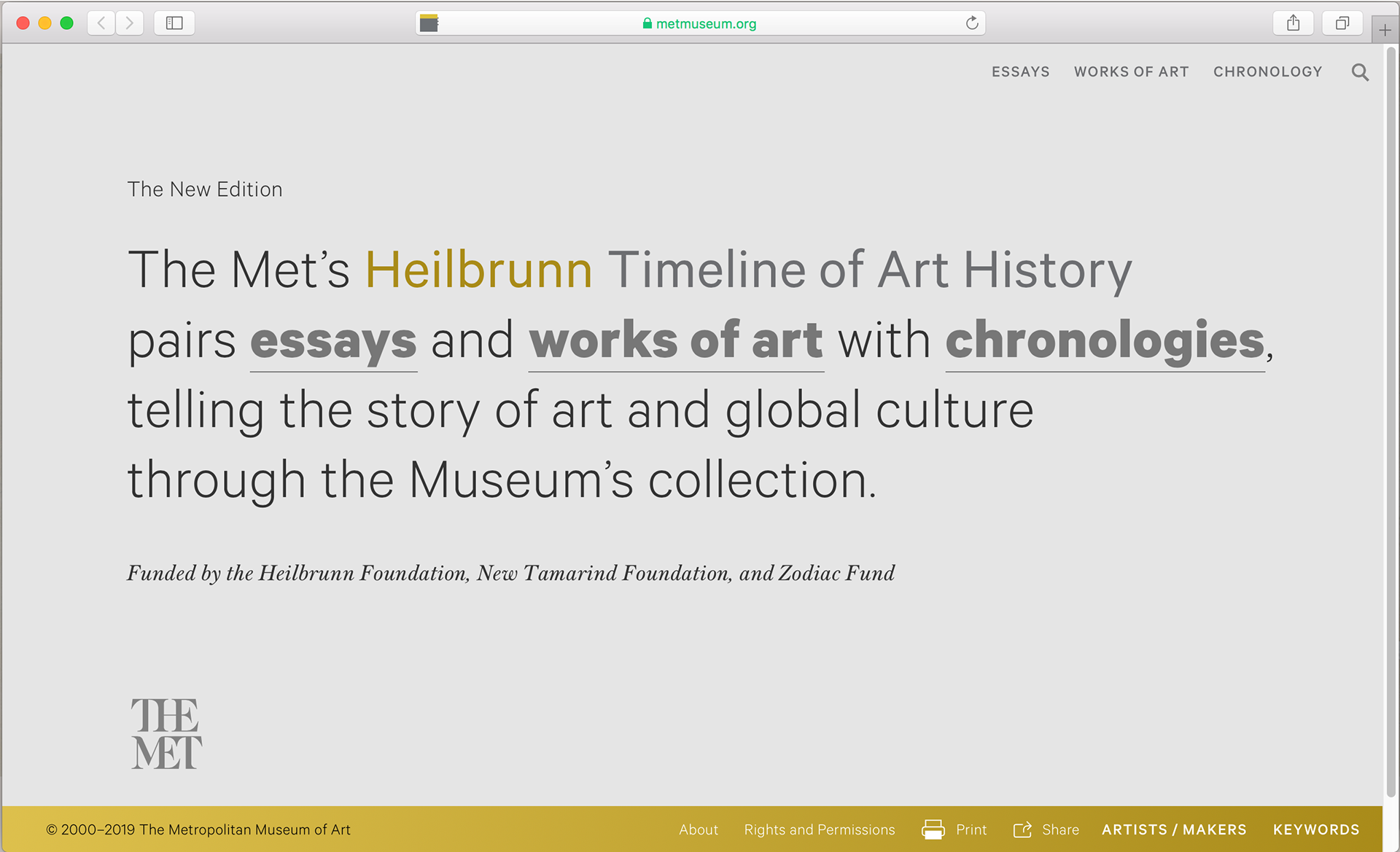
TOAH current website
Before kicking off this project, our team collaborated with The Met's UX design team to figure out the primary users on TOAH website. We found that most of the users often come from outside of the U.S. with higher educational background and there are two primary reasons for the users to visit the website -- Visit planning and research.
The Met hoped to learn more about how primary users, the international users, would understand and interact with the site as well as their expectations and to improve connection between objects in the collection and the digital content surrounding to support their next iteration of development. This study aims at helping The Met reach their goal by designing and conducting usability testing on three areas: The purpose of using TOAH website, user expectation, and discoverability of translation for international users.
The Problem
After meeting with the UX design team from The Met, we had a basic understanding of their primary users, content development, and concerns. We came up with a main problem that was considered a major blindspot for The Met -- How are international users, non-Americans, from different countries using the website are using it including their visit planning experience and research experience?
Around with the central problem, we raised several questions that guided us to approach the goal:
⦁ Some items in the collections have translated content in TOAH website, but not all. If international users expect translated content, will they be deterred if the translations are not there? Are the translations at the main Met page visible to international, foreign language speakers?
⦁ Do people want to see more visuals, less text? Are they completely wrong as far as what users are looking for when they visit? Are essays too scholarly and too many big words?
⦁ What related content do people expect to find on pages? Do the names make sense and match with expectations of what the users expect to find?
⦁ What are users looking for on TOAH website? Visuals? Essays? In TOAH website, the essays as being primary, since the main Met website does not have them. Will our user participants see it in this way?
Methodology
After defending the problem, we started to design user testing process. The purpose of this user test is to understand how users would navigate and use TOAH website, get feedback on what people like about it and identify areas for improvements. A central components is collecting data about users’ performance on a set of predefined tasks aligned with client’s goals. Once participants completed their tasks and provided feedback, the information was analyzed to determine common areas where users encounter difficulties.
Recruiting participants
As the tests aim to gain insights from international users, participants who were either international or had international backgrounds were identified through this survey. To address TOAH website as a powerful reference tool for academic research, evaluators focused on the recruitment of scholars or researcher who were familiar with the technology and had established adequate understanding of online scholarly resources.
Target audiences:
⦁ International or had international backgrounds
⦁ Completed or currently pursuing of a Master’s degree
⦁ Minimum of 3 years in research experiences
We received 30 responses in total and recruited 10 participants to join our research who matched with our user profile.
After the user recruitment, we designed 3 procedures for participants to follow for conducting the research: A pre-test questionnaire, user tasks, and a post-test interview.
Pre-Test questionnaire
Before the user tasks session, we designed a pre-test questionnaire that was given to survey the research participants’ profile focused on users’ demographic data. Additional questions obtained information on each participant’s country of citizenship, degree of comfort conducting research on the Internet, and frequency of using online research resources.
User tasks
The test was conducted in a technology lab, while a screencast software called Silverback recorded users’ movements on the screen, video of their reactions, and audio for narration. Participants were asked to “think aloud”, verbalizing their thoughts while carrying out the tasks. Evaluators asked probing questions throughout the process to better understand the decisions made by users.
The recorded video shows one of the participants conducts our user test
Participants were presented with the following tasks:
⦁ Task #1: Use a search engine to find information about Cubism
⦁ Task #2: Go to the TOAH Homepage and find information about Roman from 1000 B.C. to 1 A.D.
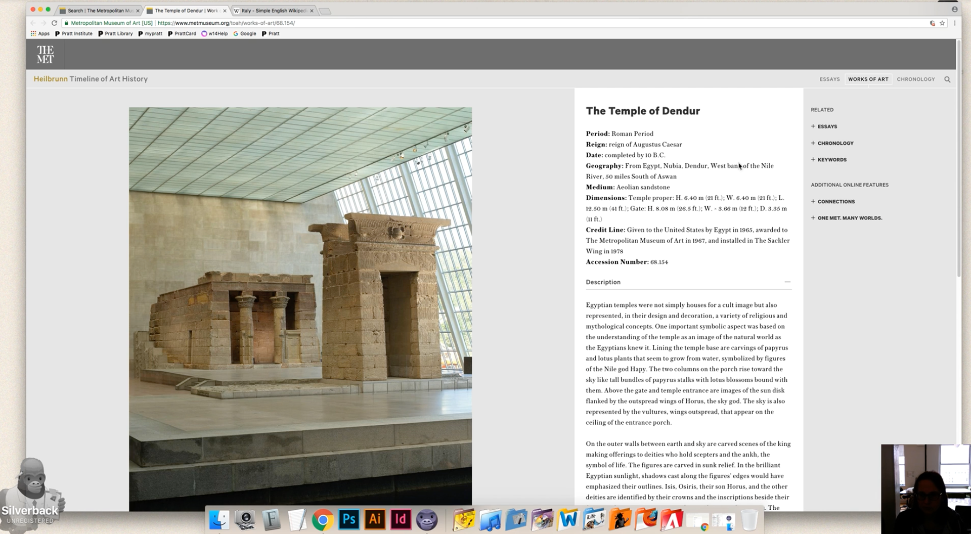
⦁ Task #3: Find "The Temple of Dendur" page using this website and browse around
⦁ Task #4: Find more information about "The Temple of Dendur" using the links on this page
⦁ Task #5: Find information about the work in your language
⦁ Task #4: Find more information about "The Temple of Dendur" using the links on this page
⦁ Task #5: Find information about the work in your language
Post-Test interview
In order to learn about users' final thoughts on the overall impression and satisfaction from experiencing with the TOAH site, we asked users a few more questions that was initiated verbally in an interview format to gather information after they completed the user tasks.
⦁ Task #1: How does the information on this page compares with other websites you use such as Wikipedia?
⦁ Task #2: Does the information regarding artists and their works found on the Met Timeline website give you more than what another, less scholarly source such as Wikipedia or Google Image would give you?
⦁ Task #3: How likely are you to recommend this site to another researcher / student? (1 = Not likely at all, 5 = Very likely)
⦁ Task #4: Please select 5 adjectives from the Microsoft Product Reaction Cards that you would describe the website.
Findings and Recommendations
The findings were developed by reviewing the observations, recorded videos, questionnaires and participant feedback. Results from user testing yielded 4 findings and recommendations that could help improve the problems of the TOAH website:
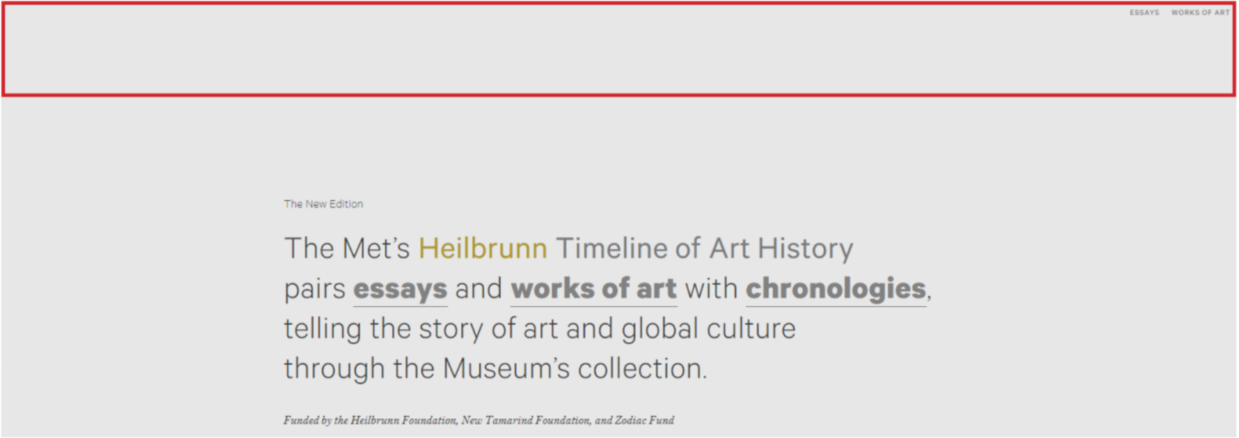
⦁ Finding #1: Users expected more guidance and visuals on the homepage
Most users thought the design of the homepage was minimal and bare in design. The structure of content felt unorganized, and users wanted more images here as well.
We have identified 4 main issues:
• The simplicity of the design is not appealing to users
• Unorganized structure of the site
• Low discoverability of the navigation
• Most of the users have difficulty to understand the word "chronologies"
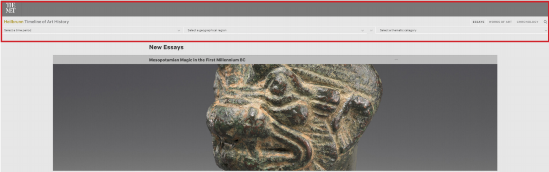
The current homepage
The current homepage does not contain the consistent header like other pages
The current filter page contains a consistent header like other pages
⦁ Recommendation #1: Improve navigation guidance and restructure content on the homepage
• Add a consistent header throughout the website, with the TOAH logo aligning next to The MET logo to help user stay on the TOAH site by avoiding navigating to The MET main page accidentally
• Highlight navigation using divider and color
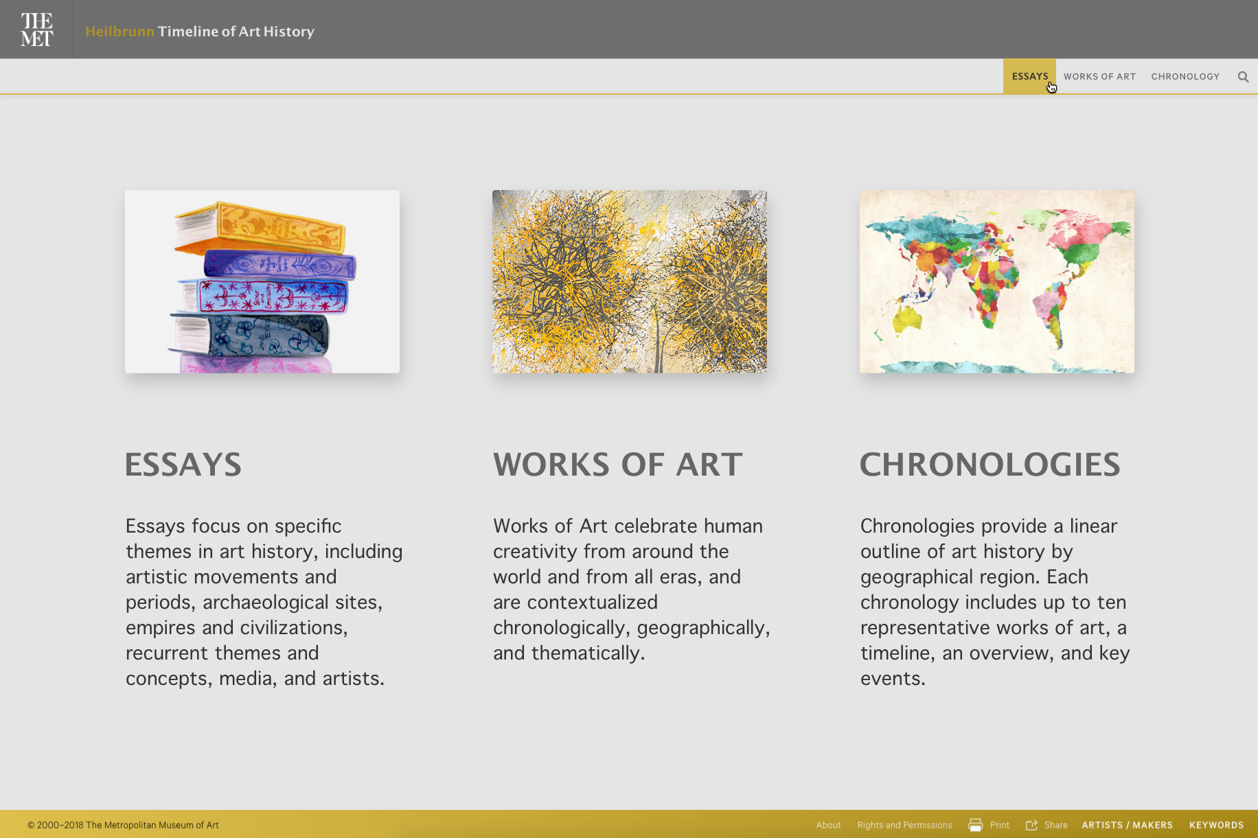
• Use a simple three column visuals with relevant images and short descriptions to help users understand what each section does (Essay, Works, Chronologies)
Mock up: Proposed changes to the homepage
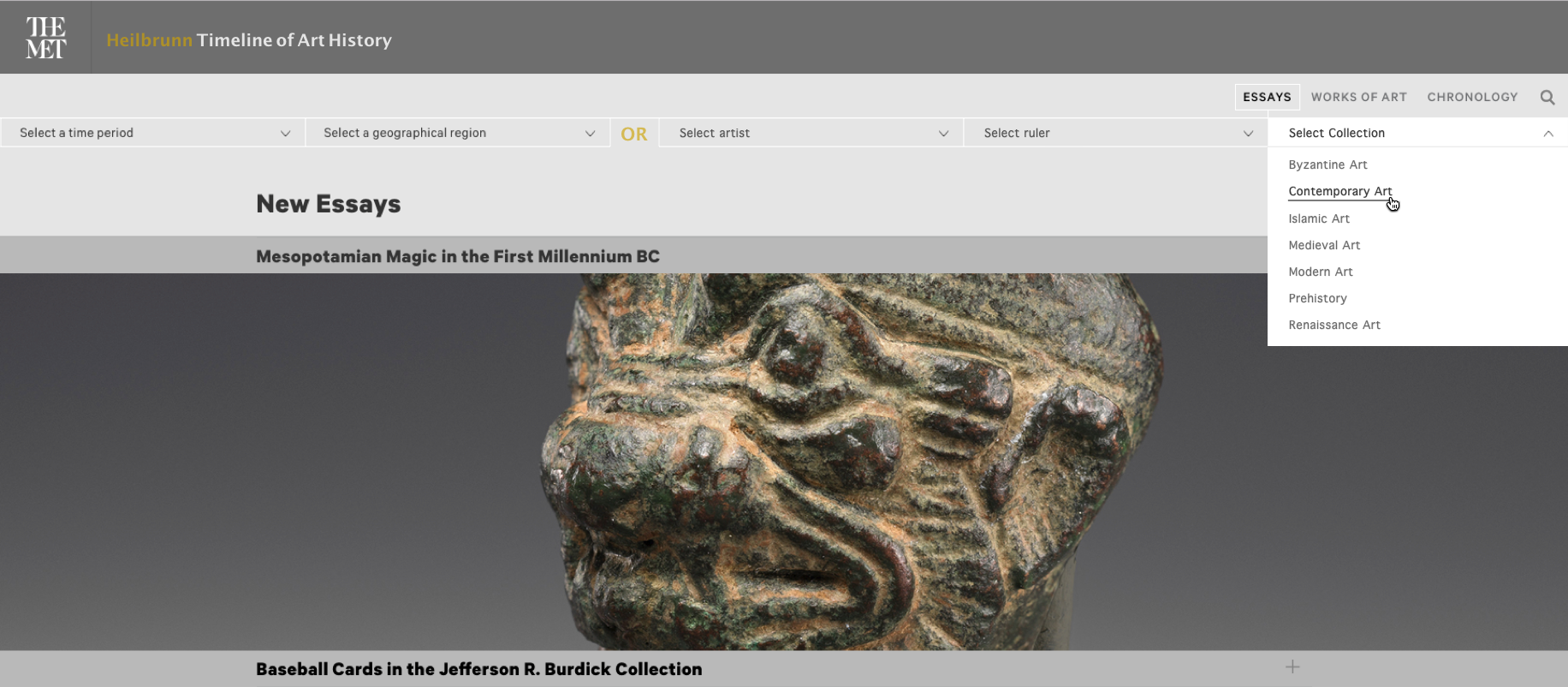
⦁ Finding #2: "Thematic Category" filter confuses users
Users struggled to see what the "Select a thematic category" filter accomplished that the other two filters were not effectively doing already, and users more than once referred to this filter as "complicated" and "confusing."
We have identified 2 main issues:
• Information in "Select a thematic category" filter are overlapped and confusing
• Most of users did no not notice "or" between "Select a geographical region" filter and "Select a thematic category" filter
• Most of users did no not notice "or" between "Select a geographical region" filter and "Select a thematic category" filter
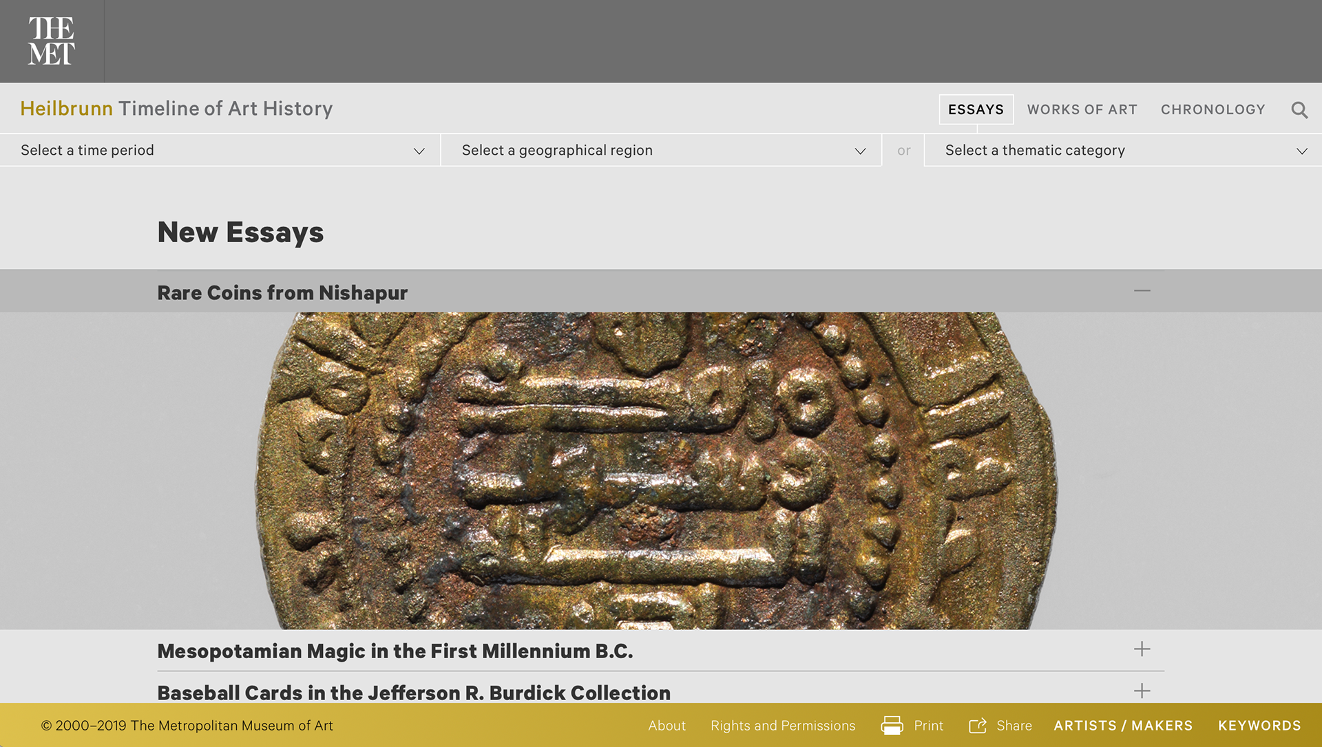
Current filter function
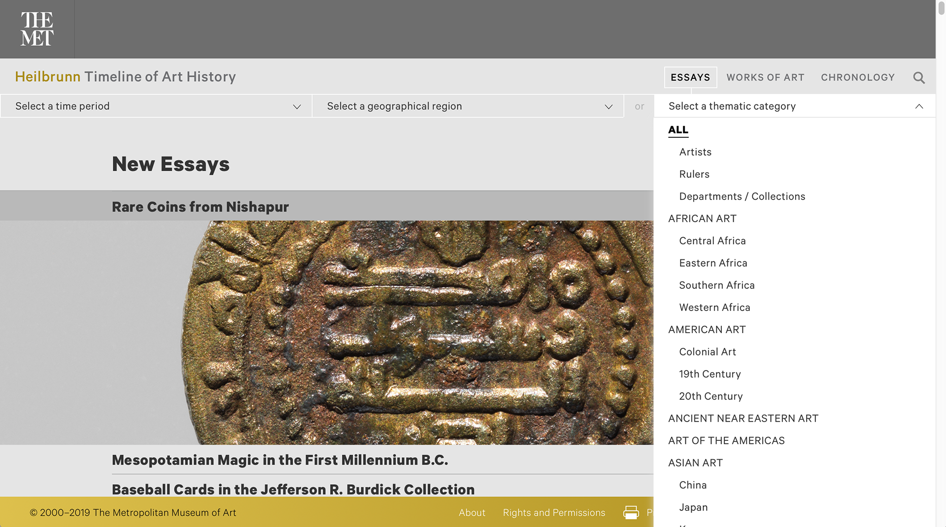
Current "Select a thematic category" filter
⦁ Recommendation #2: Redesign filters to improve search-ability
• Expand content in "Thematic category" filter tab to 3 different tabs with clear labels "Select Artist," "Select Ruler," and "Select Collection". Using more straight-forward language to this filter would make the
already-exemplary content more discoverable
already-exemplary content more discoverable
• Applying alphabetized listing to filter function allows for more-precise searching
• Highlighting the “or” between the “Geographic Function” and “Thematic Category” tab will allow users to see it more clearly
Mock up: Proposed changes to filters
⦁ Finding #3: Some design elements of object details on the "ESSAYS" and the "WORK OF ART" page were hidden
The "ESSAYS" page is used as a object heading page that leads users to the "WORK OF ART" page by clicking the gallery button on the top right side of the "ESSAYS" page. The "WORK OF ART" page shows more details about the object of the gallery which users click.
There are 4 main issues of the detail page structure:
• Gallery button in the "ESSAYS" page is not noticeable, so users thought it was just a cover image
• Users wanted "KEYWORDS" section on the "WORK OF ART" page to be already expanded
• Clickable links in the last part of the "WORK OF ART" page are varied in appearance which may reduce the opportunity for user to discover them, especially those on the right side menu
• The last link “See additional object information” on the "WORK OF ART" page is confusing, which prevents users from exploring more information about the object on The Met's main "Collections" page
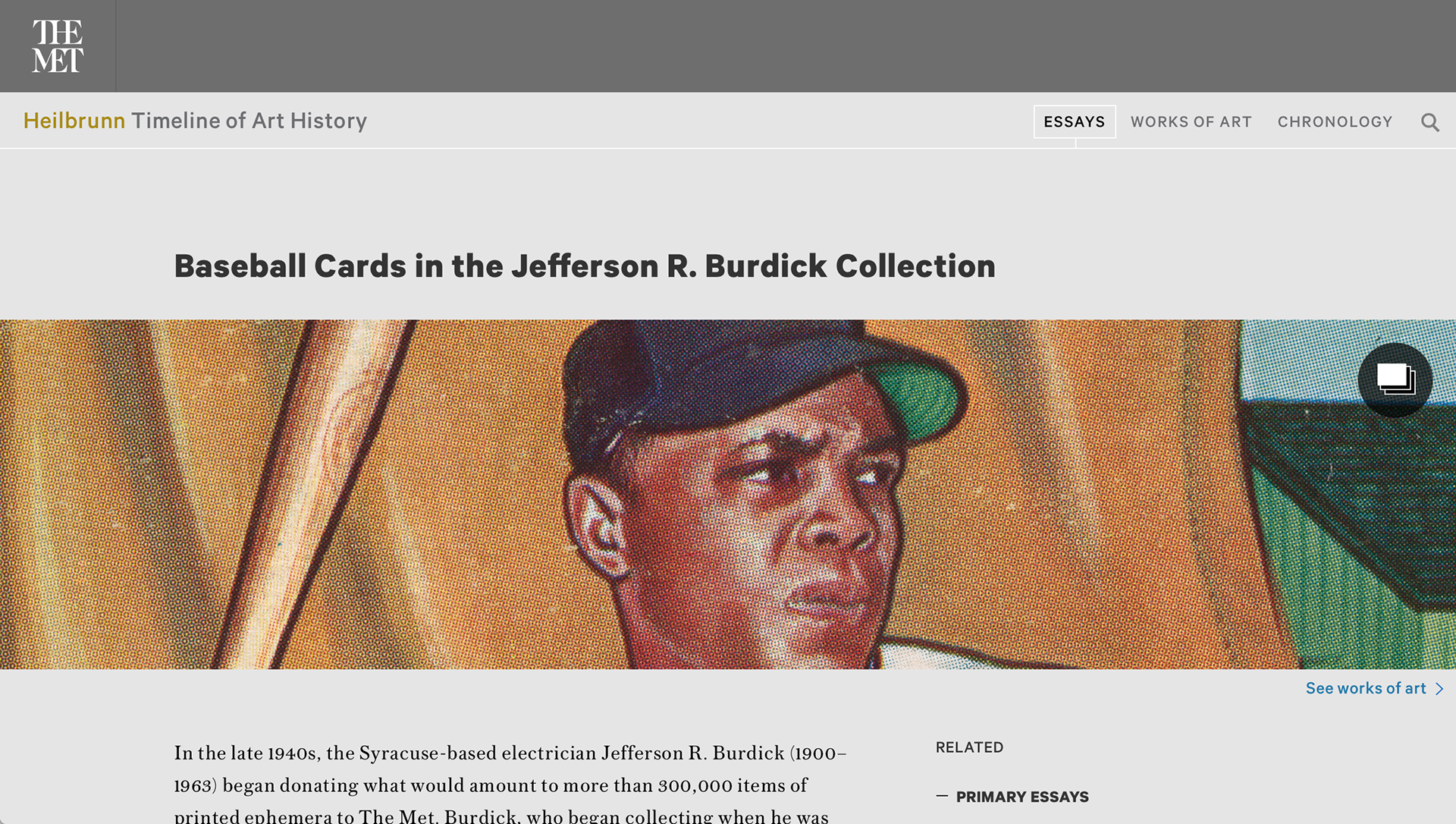
The gallery on the current "ESSAYS" page
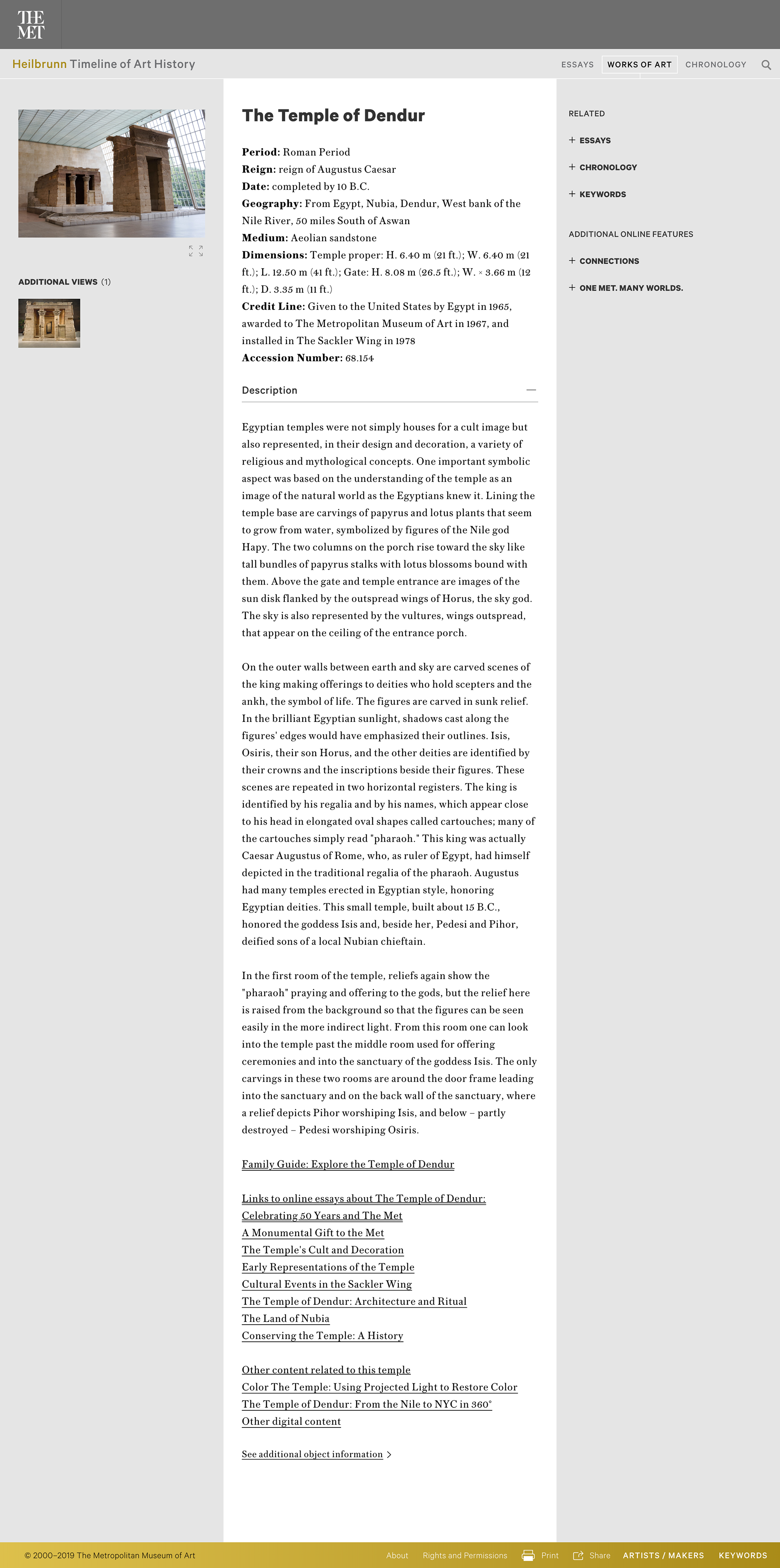
The object details on the current "WORK OF ART" page
⦁ Recommendation #3: Reorganize additional links to improve consistency and extend user journeys
For the "ESSAYS" page:
• Remove cover picture and display gallery to make it more discoverable and approachable
For the "WORKS OF ART" pages:
• Have keywords already expanded when the user opens the page
• Remove cover picture and display gallery to make it more discoverable and approachable
For the "WORKS OF ART" pages:
• Have keywords already expanded when the user opens the page
• Add underline to the links on the right sidebar to a look consistent with the links under "Description"
• Organize links under "Description" so that links to pdfs and links of normal linkable page would show differences obvious enough for international users, by adding subtitles to pdfs and normal links
• Move "See additional object information" to the bottom of the "Description" and also change to more information about this object

Mock up: Proposed changes to "WORK OF ART" page
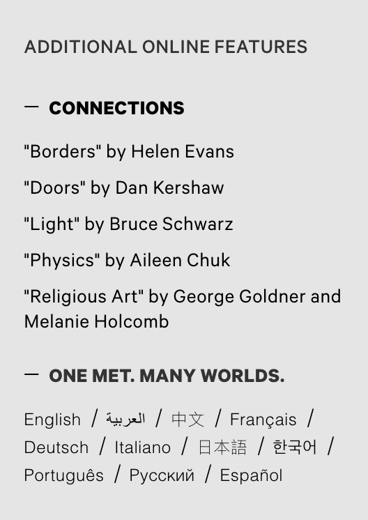
⦁ Finding #4: Language and translation options created confusion
• Unclear language of "Connection" and "One Met. Many Worlds" in the sidebar of the "WORK OF ART" page. The title of the features does not indicate what it does exactly
• Asked to find information in a language other than English, users felt translation capabilities for the Met's "Collection" page were somewhat lacking. Translation features on "Collection" are inconsistent and not available for every artwork
• Not all information translate. English pages normally have richer, lengthier content than translated ones, which might alienate international users
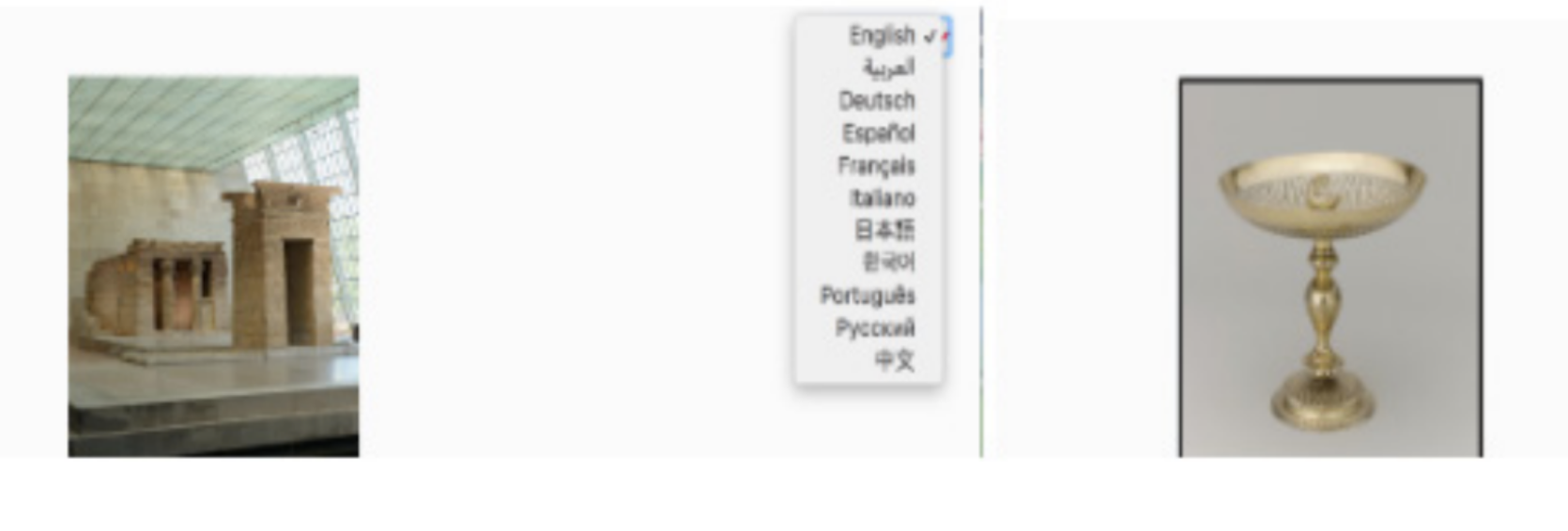
Lack of translation on wine up
Expanding of confusing labeling
Confusing labeling
⦁ Recommendation #4: Tweak navigation and language inconsistencies
• Change "One Met. Many Worlds" to "Languages"
• Change "Connections" to "Experts"
• Provide same information in other languages or add language about translation availability on each page. E.g. "We are working on translating this page. To see other art works in your language click here”
Conclusion
Our client were grateful to the result and recommendations. By implementing recommendations for redesigning the Heilbrunn Timeline of Art History’s homepage, clarifying Timeline filters and content, and enhancing translation options, the gap between an institution often favoring English and an increasingly-international audience will be bridged.
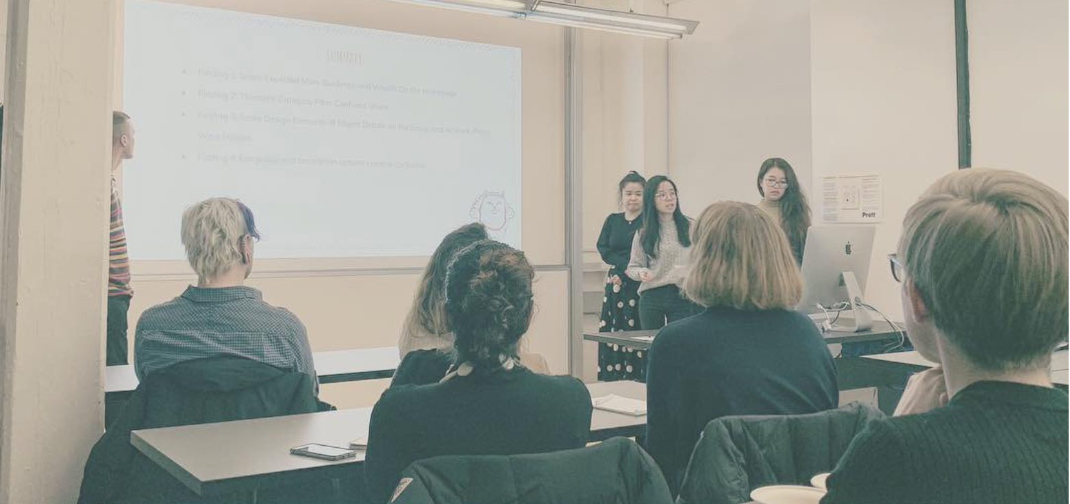
Final presentation to our client, The Met.
What I Learned
Finding a way to get the user to answer without giving them the answer: This is challenging, but effective. Asking open-ended questions but not leading questions can make the responses richer. For example, asking users “What emotion does this give you?” is better than “Does this make you happy?”