About Project
Project Type Individual project | My Role Data Visualization Designer, Usability Specialist | Duration 2 weeks
My goal of this project aims at proposing the future assumption of the world population by using the data of the global population and density from 2005 to 2018. The project focus on some certain countries that mainly affect the world’s population. The idea was generated by my curiosity as a travel lover. In the year of 2018, I had traveled to Southern American and Southern Asia. I found that the development of some countries is quite different from what I saw in newspapers and magazines. Because of these experiences, I realized that a population structure is one of the important factors that can affect country development, and this prompted me to discover 2 questions:
1. What about the demographic structures of the countries with vast territories in the near future?
2. What about the demographic structures of the densely populated countries in the near future?
Let's Play with Prototype

Inspiration
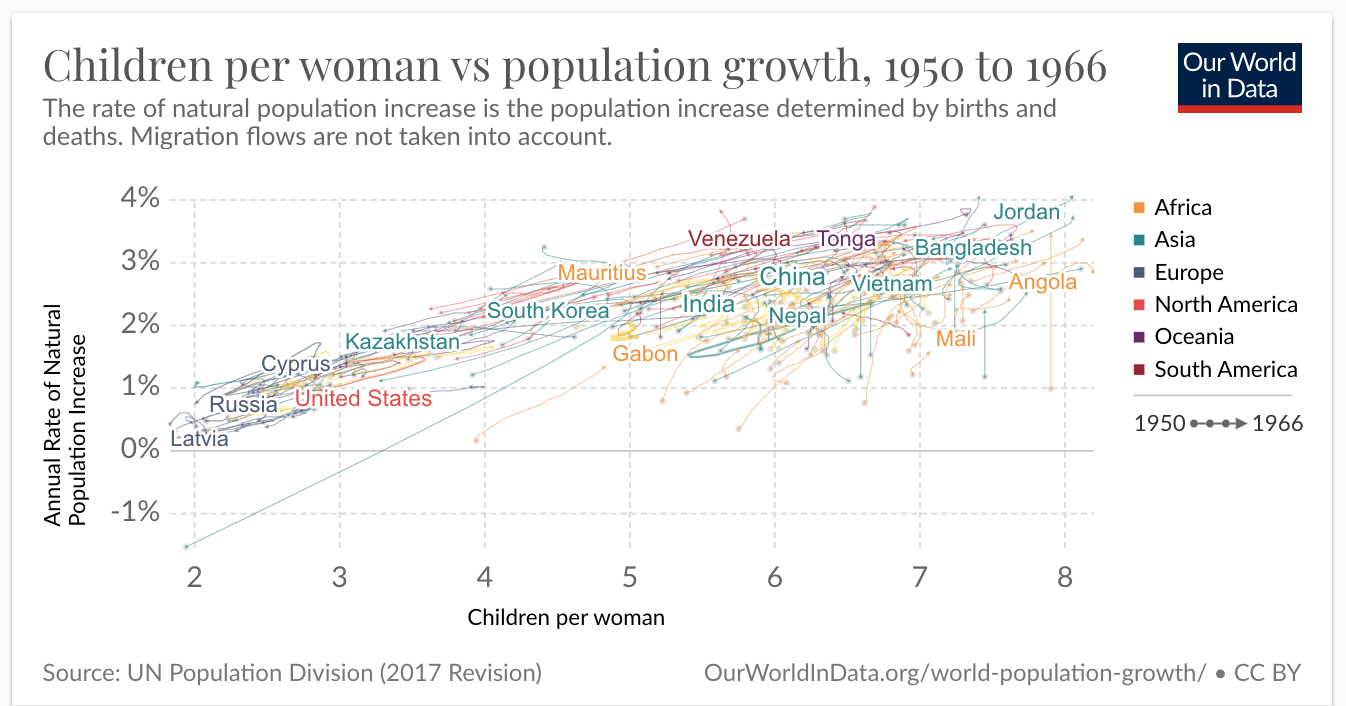
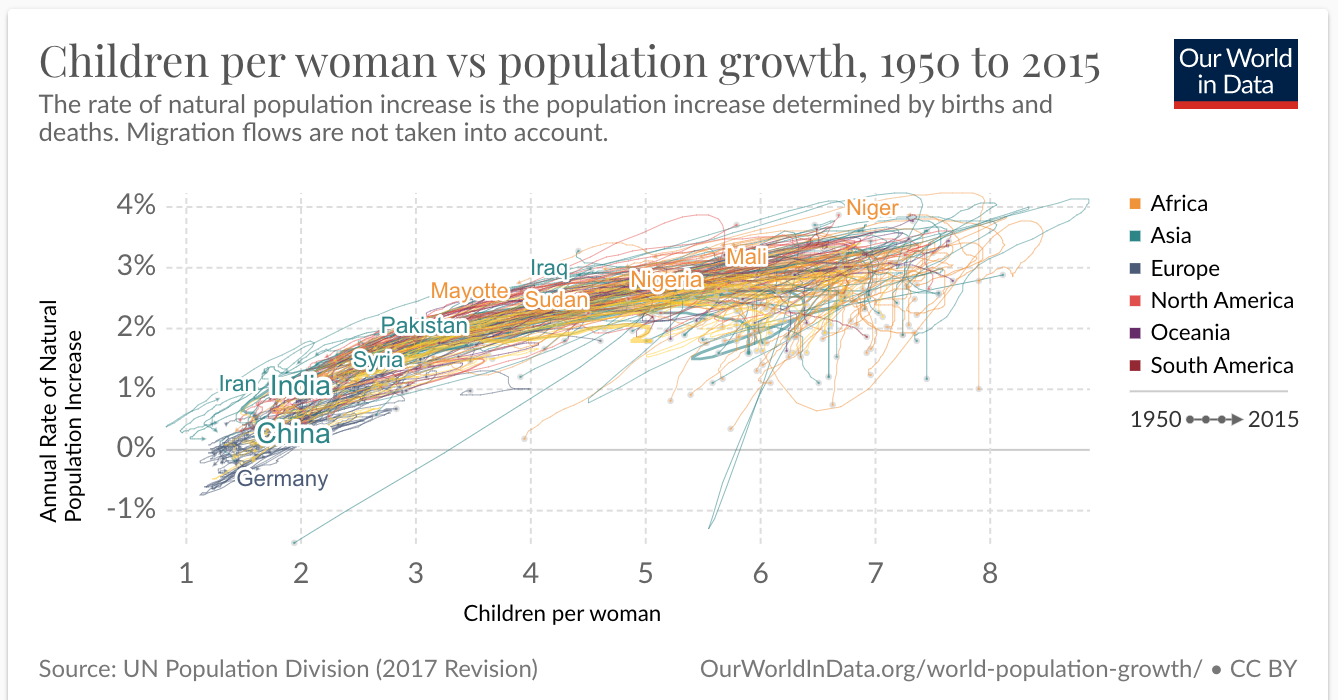
I was conducting some research related to the global population before starting my project. My ideas of the data visualizations were inspired by the three following charts, and I attempted to combine the concepts of these charts and my project's results to answer my questions.
According to the chart below, we can see the world population was increasing rapidly, and this leds me to think about which countries have larger populations.

China and India are the main contributors to the world population. United States, Indonesia, Brazil, Pakistan, and some countries are minor contributors. However, what are the demographic compositions of these countries?

Through the proportion of women to children, we can speculate about the future trend of population composition in different countries. Although China nowadays is the main contributors to the world population, it unlikes Africa countries that have a higher proportion of women to children. Therefore, maybe in the near future, African countries will become the world’s most populous countries.
Materials
⦁ Data source from UNdata: Population, surface area and density
⦁ Data Visualization software: Tableau Public
Methodology
I collected my data from the online database UNdata. I chose relevant data in recent decades as my raw data, and downloaded the files as the CSV files. Through using Excel and OpenRefine, I reorganized the data sheets and deleted some data which were useless to answer my questions. Finally, I imported my clean data to Tableau Public to build data visualization and contributed the file as an open data source to everyone.
Visualize Results
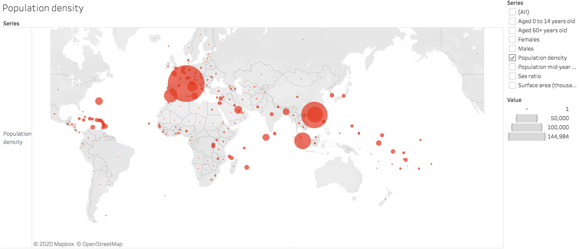
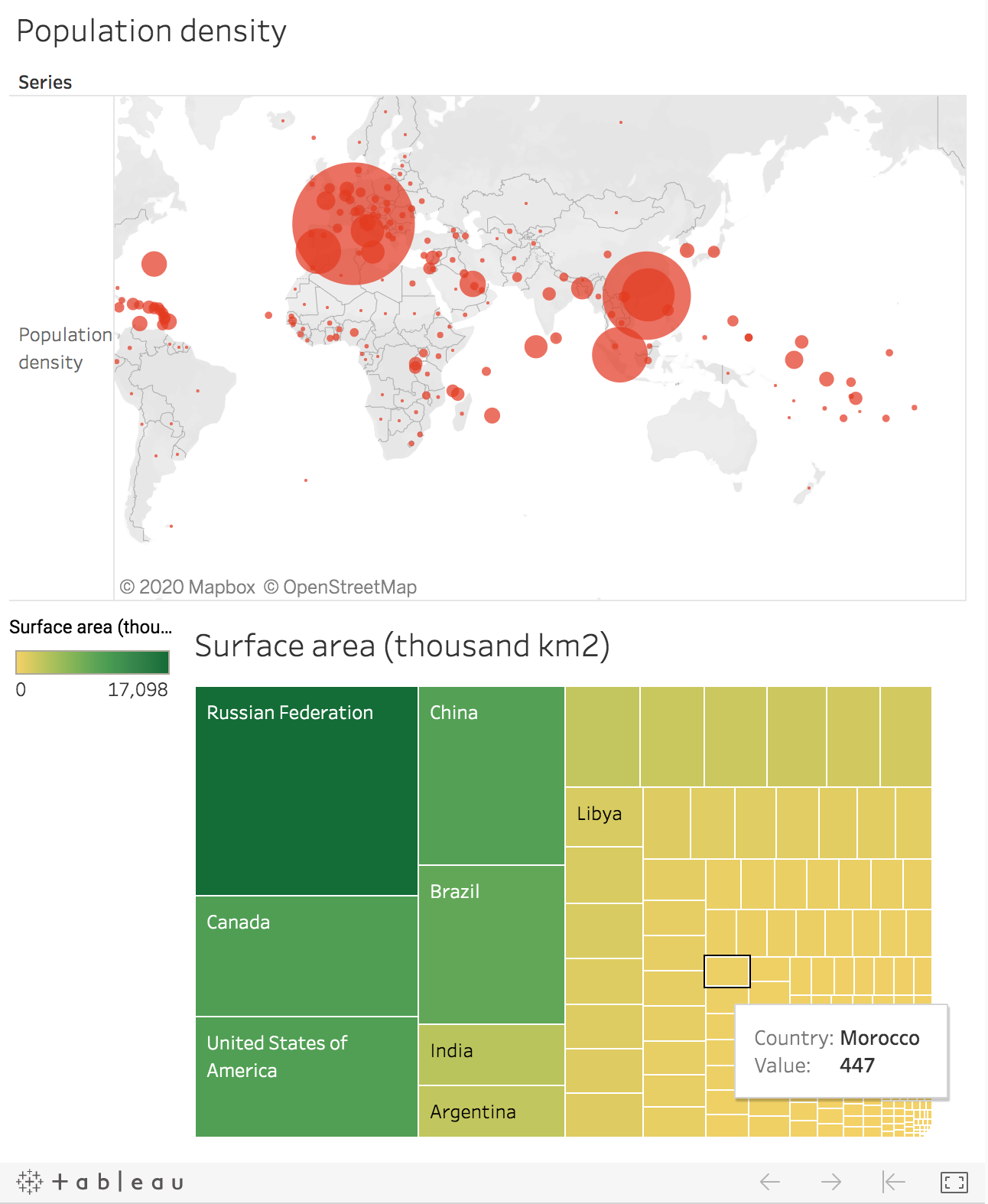
Through the dashboard, Monaco, China, and Singapore are the 3 most population density countries in the world. As we might know, China is one of the larger population countries in the world. According to the charts above, we are able to know China has larger territory like Brazil, but China is also one of the most density countries unlike other countries with large territories. Thus, we might suppose that the size of the territory not absolutely correlate to the density.
I found that the country with larger surface area often has an equilibrium of the proportion aged 60+ years old and aged 0 to 14 years old, but China, Brazil, and India have the unbalanced proportion. Their proportion aged 0 to 14 years old is higher. Another interesting thing is that Singapore and Monaco have a higher proportion of the elderly population. We are also able to know China and India have higher mid-year populations.
The numbers of males in China and India are more than the number of females. United States, Canada, Russian, Singapore, Monaco, and Brazil have a balanced sex ratio.
So, let’s back to my previous questions:
(All the hypothetical answers and results below are based on all the information in this article without any other external factors.)
What are the demographic structures of the countries with vast territories in the future?
United States, Canada, and Russian have a balanced proportion of the young and elderly population but have lower mid-year populations so I may assume that these countries would face a lower birth rate in the future.
China, India, Brazil have a higher proportion of the young population, males ratio, and stronger mid-year populations. I think these countries will maintain their birth rate for a while. However, since their proportion of women to children are lower, therefore, I believe their population structure will change in the near future and they might not be able to retain the title of the largest population.
What are the demographic structures of the densely populated countries in the future?
Singapore and Monaco have higher elder proportion than the young. If their birth rate would not be enhanced, the mortality rate will rise relatively. Aging of the population structure may cause large population migration and so on. These countries may no longer be the most densely populated places in the future.
What I learned
To summarize this project, I attempted to infer the future development of the demographic structure of different countries from using the visualization charts that I made, but I found that I could not only rely on these charts to make rigorous inferences. Because the composition of population structure is often influenced by many factors, such as national economic and policy development. Therefore, in the project’s future direction, I hope I can build other relevant data combined with the current charts and make a better result for the future assumption of the world population development.