About Project
Teammate Engineers, Researchers | My Role Usability Specialist, Interaction Designer | Duration 3 months
The goal of this qualitative study is to understand user behaviors and mental models on engaging in a search system and online customer service.
Pratt Institute, one of the top colleges for art and design, has launched several changes on its library website recently. The librarian team was looking for gathering user feedback to improve user experience for library users. A team of 10 researchers were assigned the task to propose recommendations for improving its online experience. My team focused on:
⦁ Search bar feature on home page for researching book, articles and guides
⦁ Online customer chatting service , “Ask a Librarian”, to get assistance from a real librarian in real time
Stakeholder Expectation and Initial Problems
To better understand the need and current state of Pratt Library, we first hosted a stakeholder meeting to interview with the library Digital Learning Manager. From this meeting, I learned the stakeholder expectations and initial user problems as below:
⦁ The librarian team would like to know how users interact with the search bar and online customer chatting service and how they navigate search results; expected search bar to act like a big funnel that pulls users in
⦁ The target audience that the librarian team wanted to understand is Pratt students who are also desktop users
⦁ While users complained pop-up function is annoying, recent data shows a great increase attraction to the online customer chatting feature
⦁ Users seems likely to experience difficulty downloading contents from search results
Design Research
With the findings in mind, we started out our hypothesis that the user pain points occur during the search flow, discovering the homepage and completing task. Because of the variety in users’ browsing behaviors, we decided to design our research tasks relying on quantitative data but also with qualitative metrics and tools as additional support to understand user problem:

We applied eye-tracking technology during the test to get strong supportive evidence because it can provide us with rich behavior data on a user's interaction with the page, as detailed as where the user's gaze lands on the page.
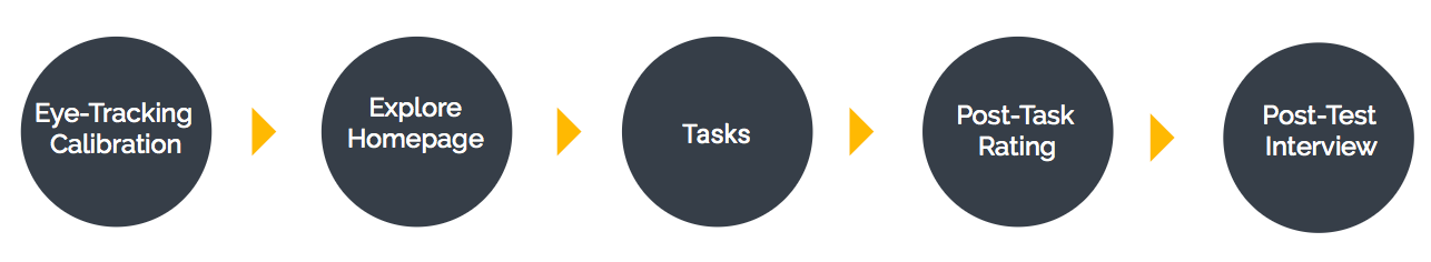
Test users would have 30 seconds to browse the homepage and take tasks while think aloud during the processes. Think aloud method helps testers avoid getting distracted and avoid difficulty from recalling their thoughts after the test, helping us gain accurate qualitative data. Upon each task completion, test users rated task difficulty on a 1-4 scale and shared more details on certain comments or struggles in the end of the process.
Data Analysis
We totally recruited 6 tester enrolled in Pratt Institute and maintained the good balance between undergraduate and graduate programs. I interviewed, observed and made notes for 4 out of 7 users during each testing section including user quotes, interaction patterns, thoughts, and difficulties. The average complete time of the entire research for each participant was about 40 minutes to 1 hour long.
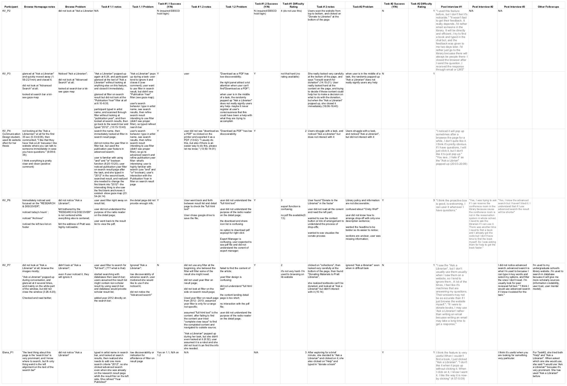
After gathering first-hand data from the test, I started to dig out roots of the problems from each task while watching eye-tracking gaze replay and then consolidated problem roots into the below problem list based on frequency of occurrence.
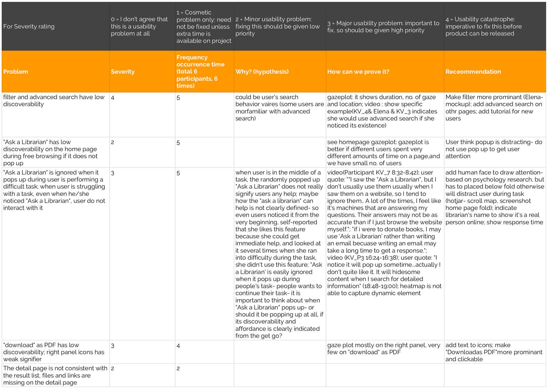
Based on the frequency of occurrence and average severity rating of each problem, we aimed at 4 priority problems to solve in this study:
⦁ Filter and Advanced Search has low discoverability
⦁ “Download as PDF” link has low discoverability
⦁ “Ask a Librarian” feature has low discoverability without popping up
⦁ “Ask a Librarian” is ignored when it pops up, even when users are experiencing difficulty with tasks.
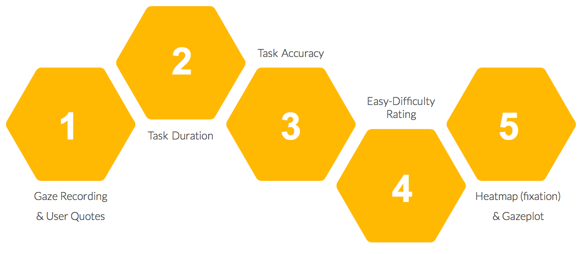
Analysis Metrics
As the design of this research, we considered task duration, task difficulty, task success, heatmaps and gazeplots as quantitative metrics to help explain our findings from qualitative analysis. However, I found that qualitative data from gaze replay can be contradictory to some quantitative data, users’ self-reported. For example, the "downloading the PDF document" process was rated as high success rate and low difficulty, while gaze replay showed participants had been scanning the page for an extended time and their gaze never landed on the UI icon of “Download as PDF”. They were actually struggling with it.
I learned that qualitative data from eye-tracking gaze let me understand users’ actual behavior, interpreting quantitative metrics in a qualitative study.

Eye-tracking calibration

Monitor a participant's experience
Problems & Recommendations
After the qualitative data analysis, we discovered the pattern of the user search journey:
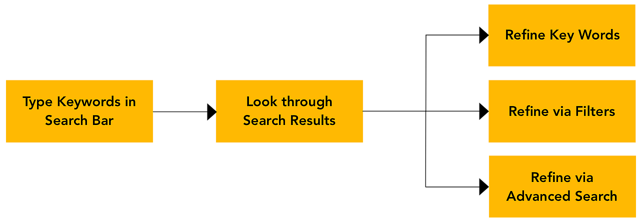
They looked around the homepage and typed in the simplest and the most significant key word in search bar. After scanning the search results, some users choose to refine it by Advanced Search or side Filters, and others went back to refine keywords directly.
Problem #1: Filters and Advanced Search have low discoverability

"I would use Advanced Search if I noticed its existence." -- Participant #4
Even though there was high success rate and okay difficulty rating in task #1, the gazeplot illustrated 3 users (2 females / 1 male) were clearly having trouble locating either Filters or the Advanced Search while trying to refine the result. Instead, they went back to the search bar and refined the keyword.
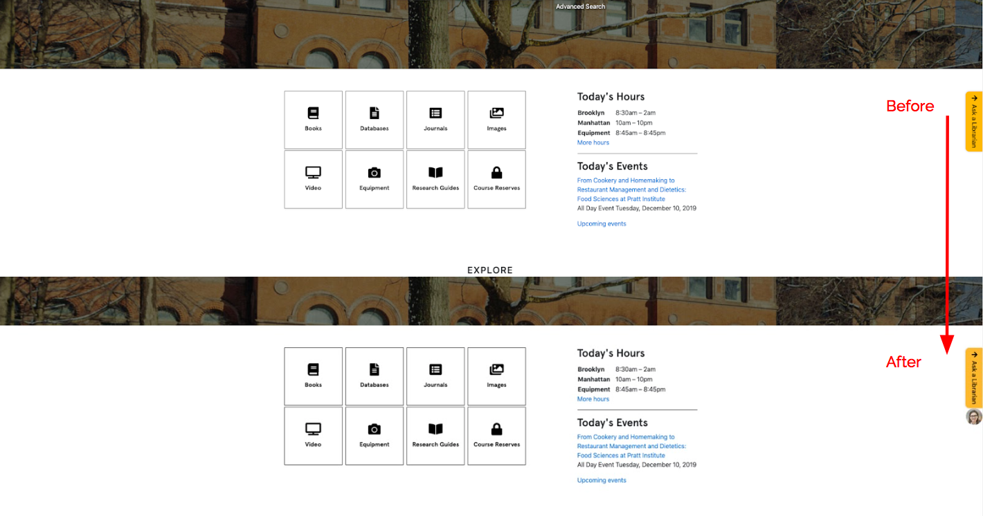
Recommendation #1: Increase color contrast in header design for filters, and increase proximity of “Advanced Search” and “Search” button
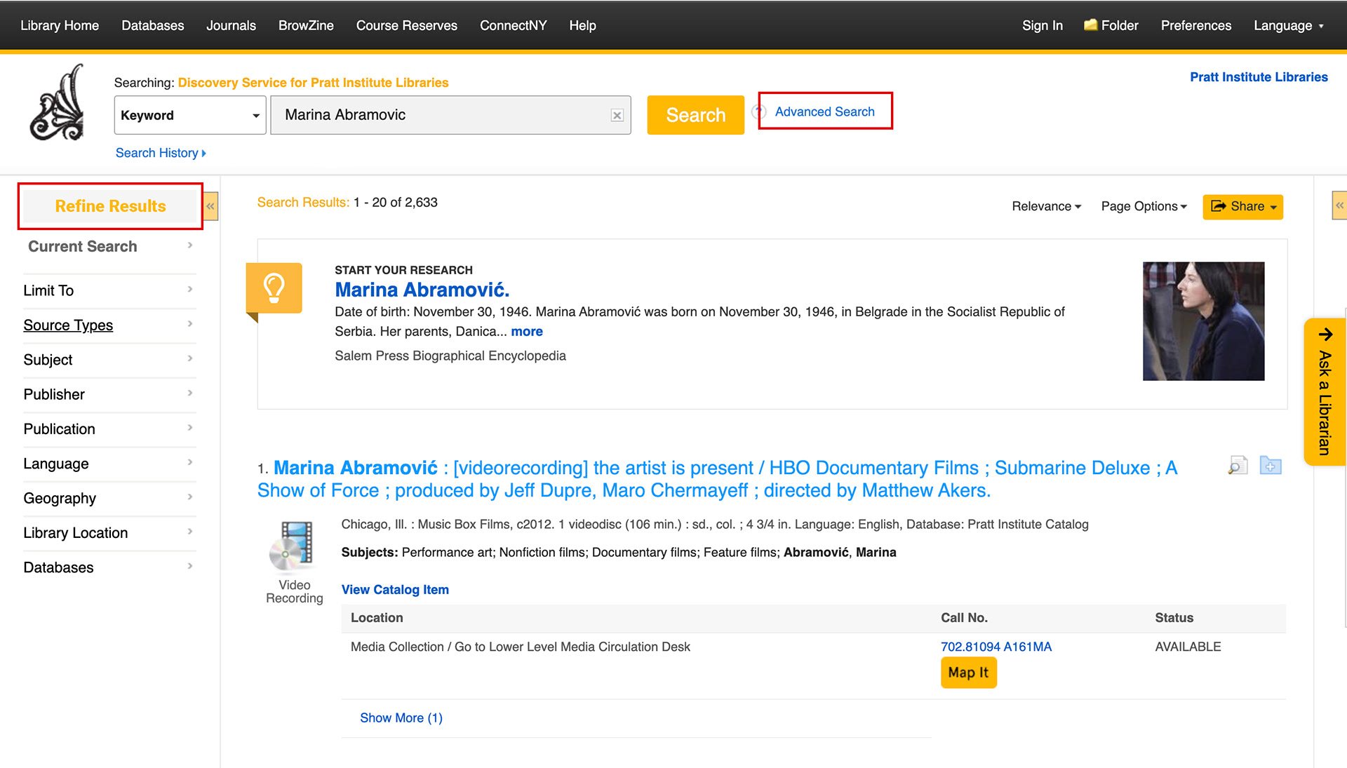
After discussing about the capability with an engineer from the library, I adjusted the color from black to yellow on the title of "Refine Results" on the side bar, which makes it stand out and more prominent. I also re-positioned Advanced Search's link next to the “Search” button of the search bar. Because their UI serve similar functions, grouping them together can provide cues for users’ attention when use one of it.
Problem #2: "Download" as PDF has low discoverability and the right panel icons have weak signifier
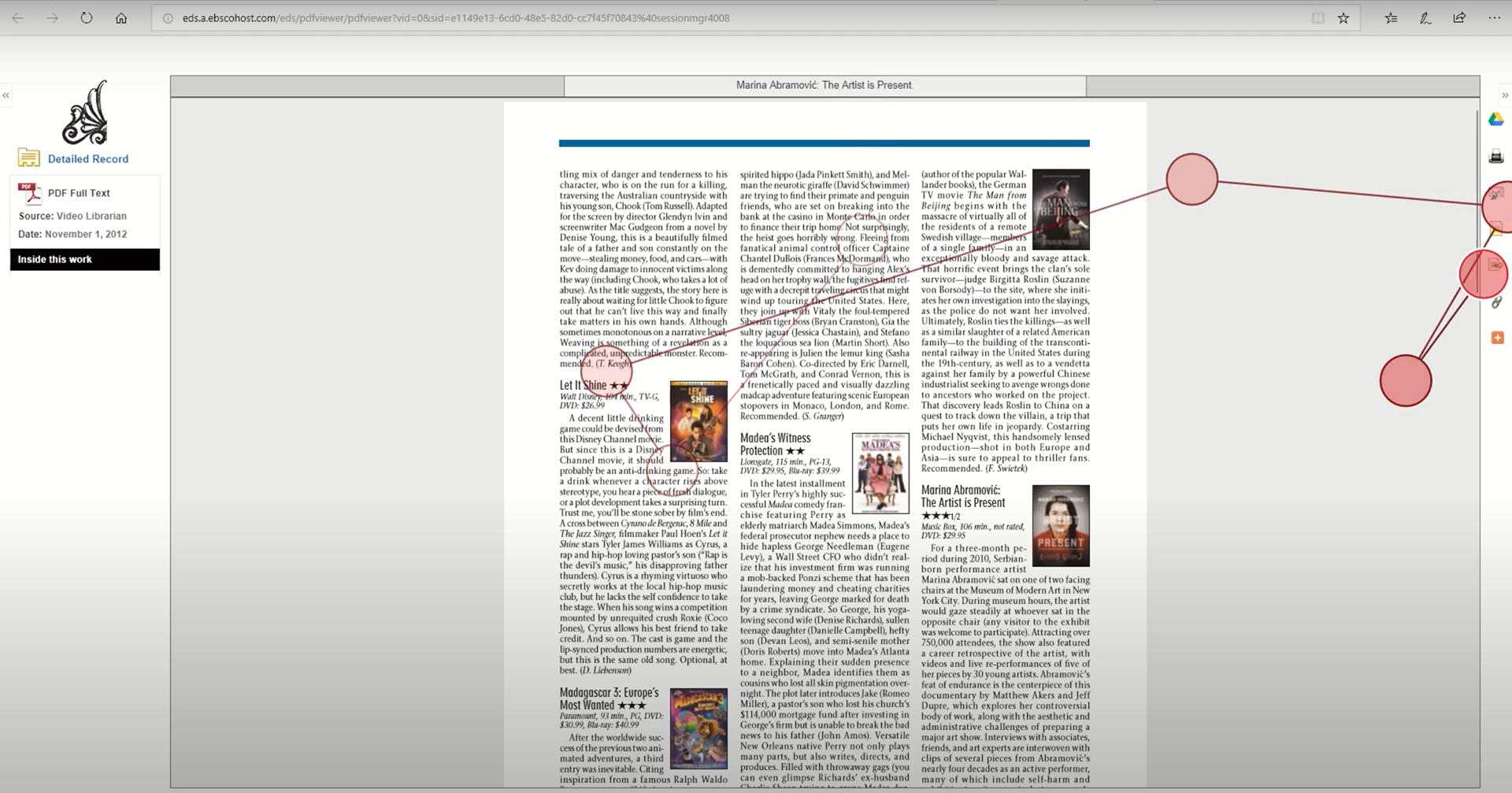
I discovered that all users used the panel on the right side to keep PDF file using different ways, rather than “download pdf”; and there is not clear signifier of what the icons mean on the right panel.
Recommendation #2: Move “Download as PDF” to the left column and make it looks clickable, while adding text to icons to clarify affordance
I designed "Download as PDF" like a button to signifies its interactive nature and placed it to the left upper portion of the page to increase discoverability that benefits F-Shaped pattern for reading web content. Besides, I added text to clarify the functionality of each icon on the right side panel to users.
Through the data analysis, I also uncovered user mental model that showed their great expectations as requirements when it comes to engage with online customer chatting service , “Ask a Librarian”:
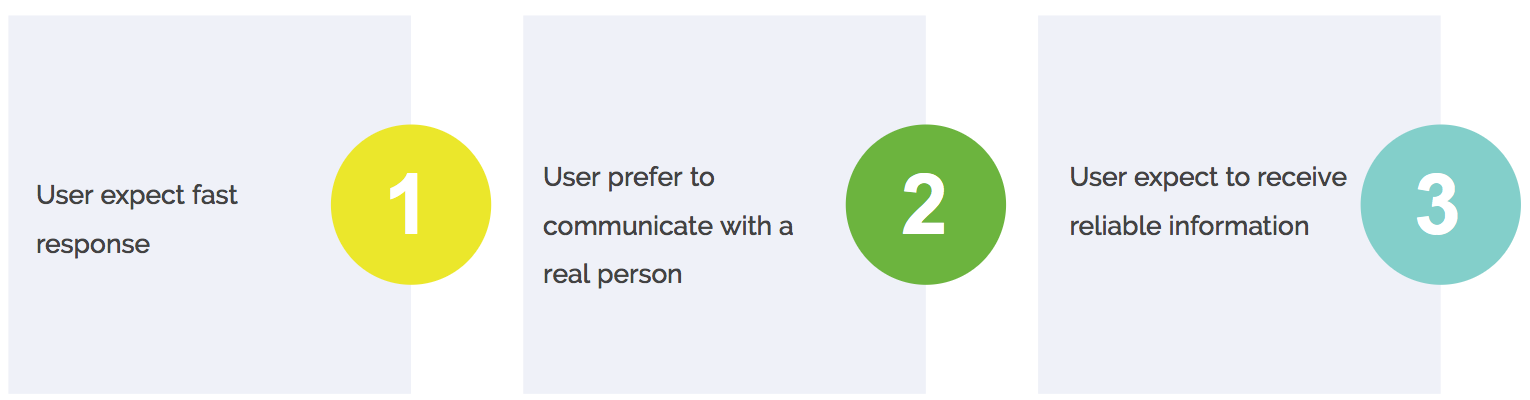
"If I were to donate books, I may use 'Ask a Librarian' rather than writing an email because writing an email may take a long time to get a response." -- Participant #3
“I saw the "Ask a Librarian", but I don't use it usually, I tend to ignore them... A lot of the times, I feel like it's machines that are answering my questions. Their answers may not be as accurate than if I just browse the website myself." -- Participant #7
Problem #3: The chatting feature has low discoverability on the home page during free browsing if it does not pop up
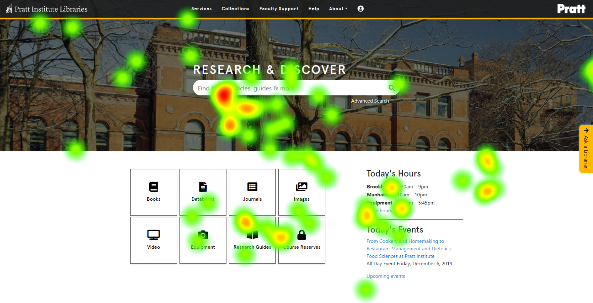
I discovered that during the first 30 seconds for users to browse home page, users’ gaze rarely landed on “Ask a Librarian” feature if it did not pop up. The heatmap above shows the users’ attention mainly focuses on the center of the home page rather than “Ask a Librarian” on the right side of the page.
Problem #4: "Ask a Librarian" is ignored when it pops up, even when user is experiencing difficulty performing a task.
"I notice it will pop up sometime...actually I don't quite like it. It will hide some content when I search for detailed information" -- Participant #2
During the testing, I observed that none of the users considered to use this chatting feature. They continued with tasks on their own without interacting with it, even though it popped up and their gaze located on this feature several times according to our gaze replay.
Recommendation 3 & 4: Increase feature's discoverability while adding design elements to fit user mental model.
I learned from attitudinal data that the pop-up function is not welcome. Plus, Problem #3 and #4 indicate whether the pop-up function exist or not, it is not effective in attracting engagement when the design doesn’t signify the feature meets the user mental model.
After discussion about the capability with an engineer from the library team, I decided to remove pop-up function, keep the chatting box closing, but add a human face image to stick on the chatting service because people’s attention is naturally and easily drawn to human faces over text according to psychology research.
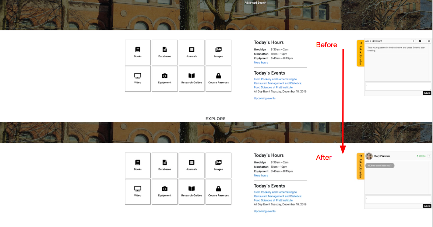
To meet user expectations, the mental model, I added new features to show the librarian's name and "online" status when the chatting box was expanded, increasing the credibility and efficiency of information that users learn.
Feedback
We presented our findings and recommendations as well as data analysis to the librarian team in the last meeting and got an overall positive feedback:
“The problems that the team identified and recommendations as extremely 'on point'. These findings will be very useful as we continue to update our website. I would love to work with the vendor to implement these recommendations soon.” - Digital Learning Manager at Pratt Library
What's Next
For the next step, I would like to develop a high fidelity prototype and involve Google Optimize to conduct A/B testing to gain large data to see if our redesign recommendations solve the problems we identified.