About Project
Teammate Engineer, Marketing, Research Team | My Role Product Designer | Duration 13 Weeks
This project focus on solving the advertiser and job seeker problem by enhancing the discoverability and visibility of job postings on a 4 and 8-week advertising schedule.
Background
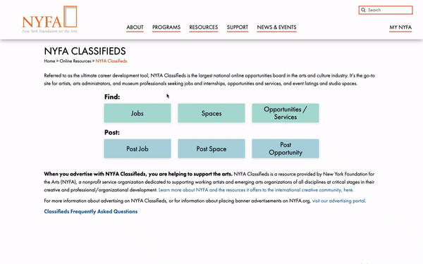
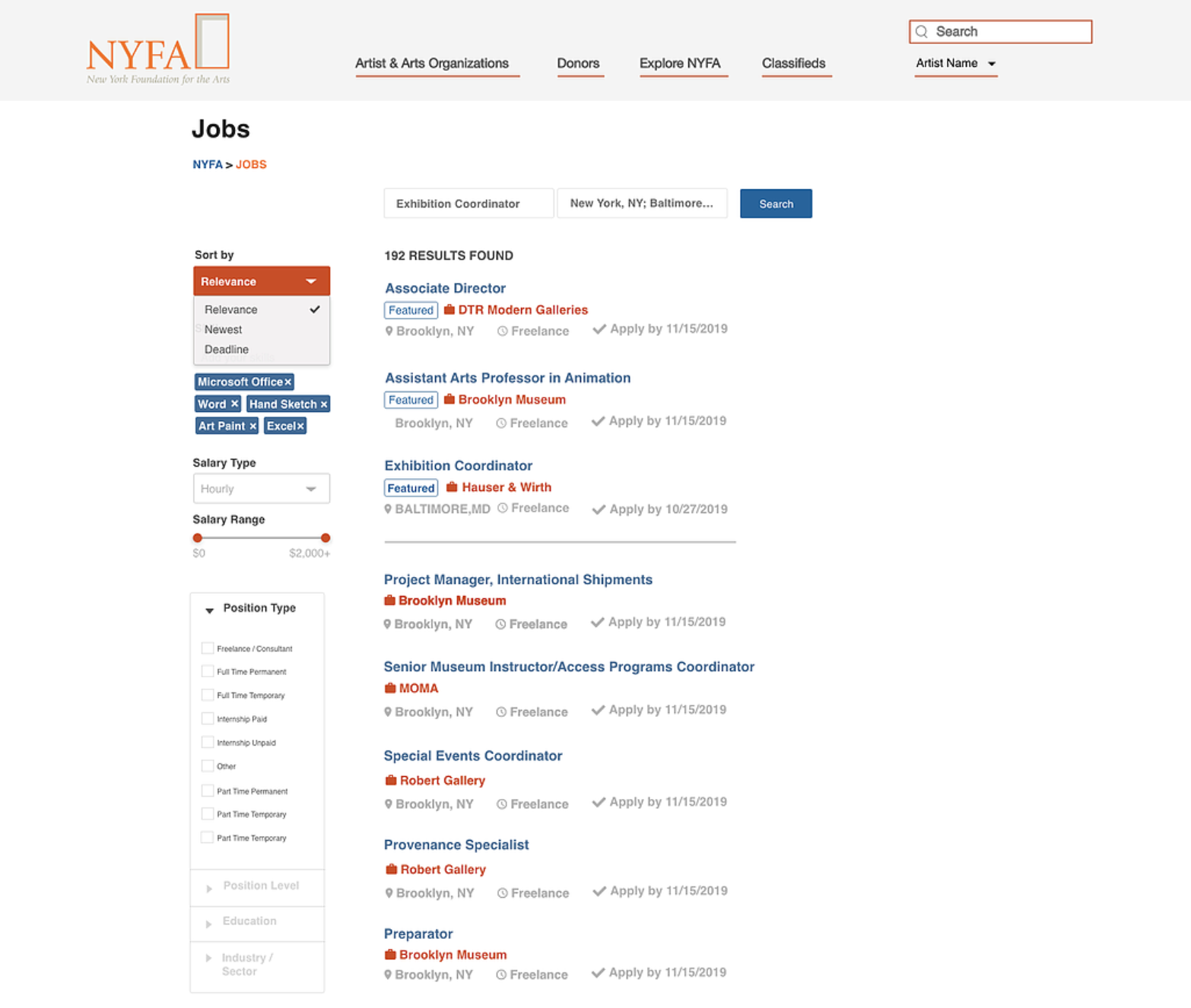
The original version before our design
New York Foundation for the Arts (NYFA) supports working artists and emerging arts organizations of all disciplines at critical stages in their creative, professional, and organizational development.
According to NYFA, NYFA Classifieds is the largest national online opportunities board in the arts and culture industry. This site is designed for artists, arts administrators, and museum professionals seeking jobs and internships, opportunities and services, and event listings and studio spaces. Entrepreneurs are also encouraged to advertise with NYFA Classifieds by posting vacancies to help support the arts.
Before the project
Before joined this project, I had a great opportunity to collaborate with NYFA's Digital Marketing Analysis team to analyze general audience behavior. I helped the team to build customized dashboard from Google Data Studio which can be connected with Google Analytics so NYFA can monitor website performance on an ongoing basis, enabling NYFA to segment users by device, age, user type, and city (within the U.S.). Some of the findings were also took into consideration in the initial user research of this project:

⦁ Users are primarily new visitors, mainly female, in the age range of 25-34, and from New York
⦁ 59.32% of overall users browsed the site on a desktop and 37.69% used mobile devices
⦁ The top browsers for users are Chrome (52.4%) and Safari (40.9%) which correlate with the high number of desktop users
⦁ Apple iPhones being the most widely used mobile device (79.37%) of mobile device users
⦁ There were a total of 2.2 thousand unique searches conducted on the site in April, with the top 6 search terms being variations of the terms “jobs” and “internships”
⦁ The search for internships may suggest that many users are at the beginning of a career track, whether just entering the job market for the first time or switching career paths
⦁ An analysis of sessions over time show that user engagement is high on Mondays, declining throughout the week before dipping during the weekend, then shooting back up at the start of the week.
⦁ Similarly over the year, January is the high point for user engagement which slowly declines throughout the year until dipping in December during the holiday season
Get Started with Talking to Stakeholders
To start the project, we first talked to three stakeholders from Engineer and Marketing team to understand their expectations and the targeted users.
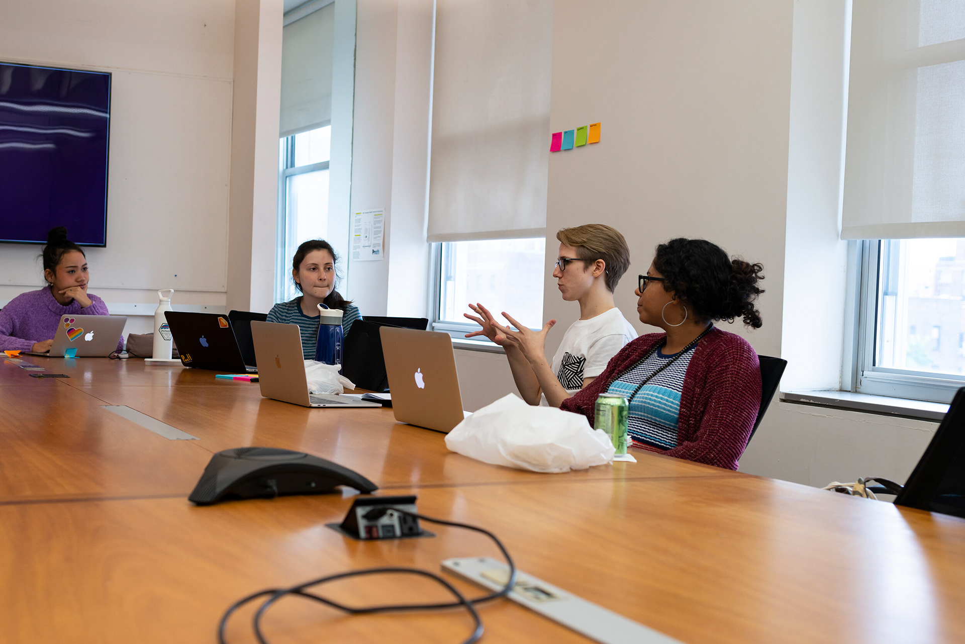
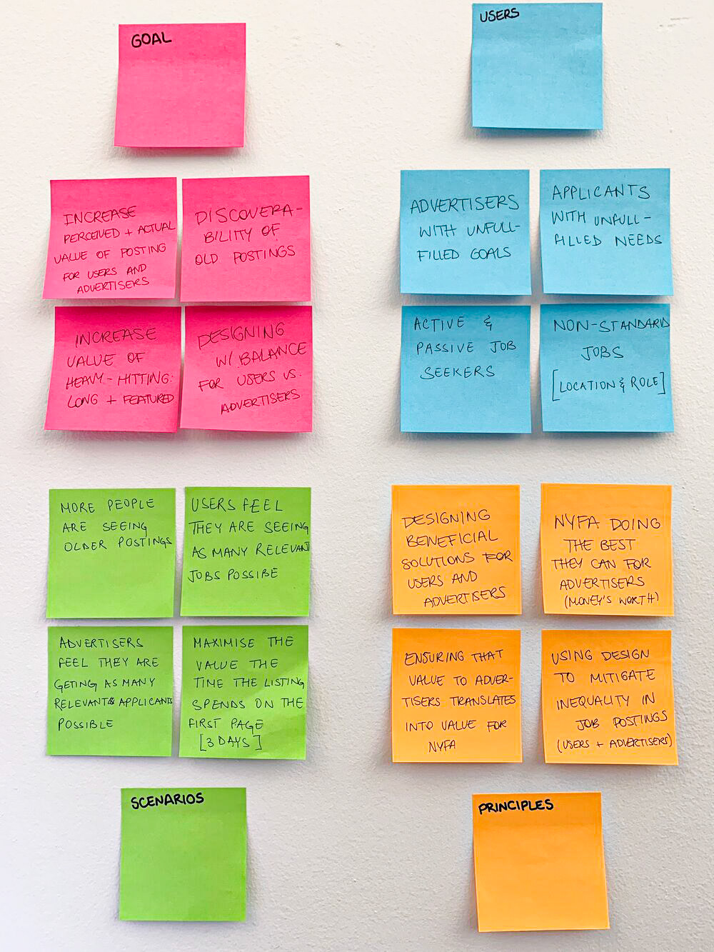
I invited them to develop a 4x4 design brief to build consensus so I could define and scope the project challenges and secured stakeholder buy-in. It’s a very effective way to understand and align our vision for the project I was working on. After collecting all the answers, our team had a brief session to condense a mission statement for this project by writing down on the Project Definition Form.
4x4 design brief
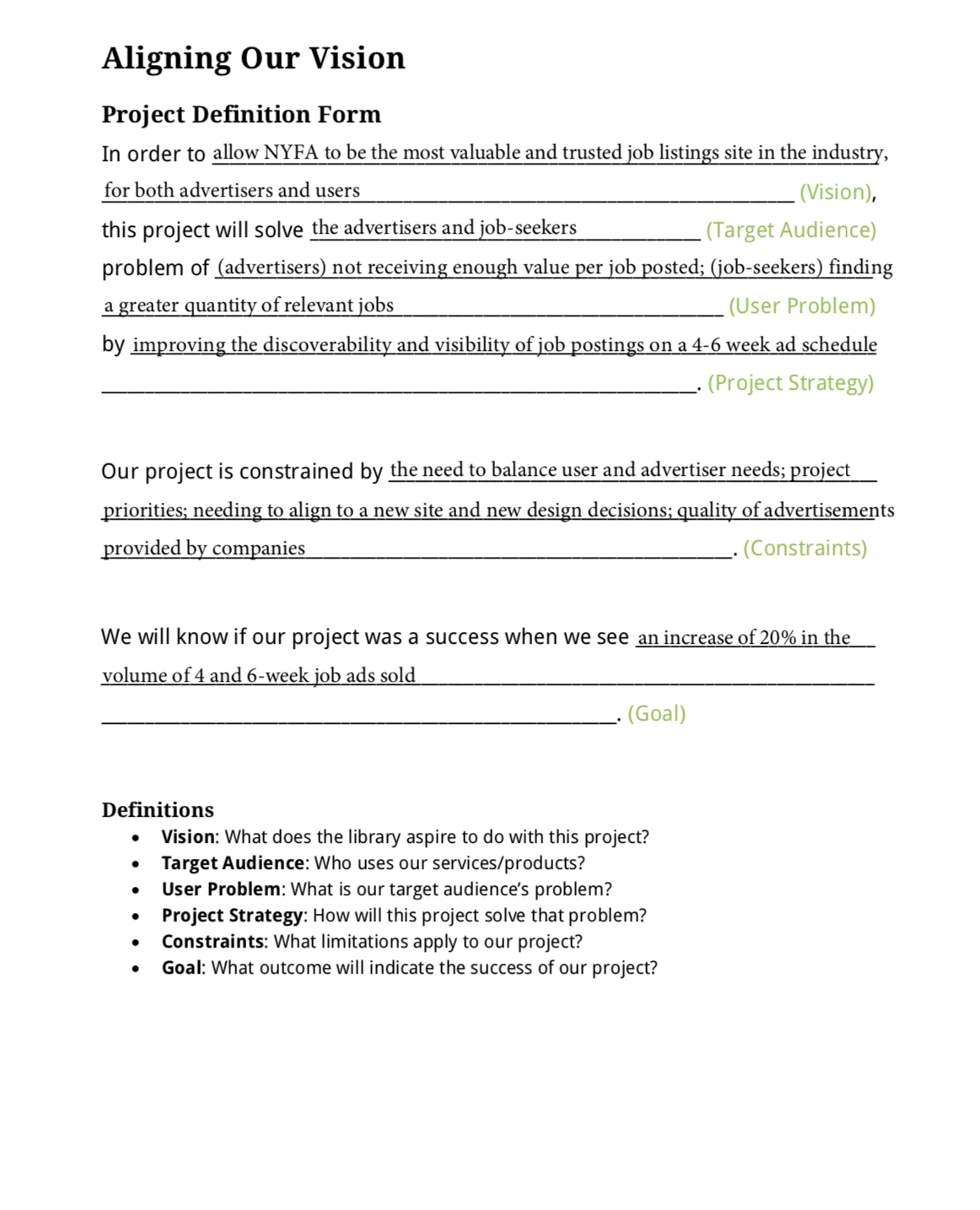
Project definition form
The Mission & Problem
From that workshop, it was clear that we would need to consider 2 tracks targeting on 2 user group problems:
Track #1 Increase job listing engagement
A new vacancy post often gets a sudden spike in direct traffic on NYFA Classifieds website during the first few days of the posting. As time goes by, that post will be listed behind other newer posts so job seekers may not easily and usually find it, even though they are a great fit for.
Track #2 Increase advertising revenue
The main source of NYFA income comes from advertising fees on their job board website. They hope to increase their advertising revenue as well as provide help to advertisers.
Design for Track #1
After understanding the user problems and with being aware of the user patterns above in mind to help define project prioritization and marketing strategies, I decided to conduct user interview for digging out the root of problems to understand users' needs to enhance job listing engagement and platform searching results for job seekers.
Understand job seeker users' needs
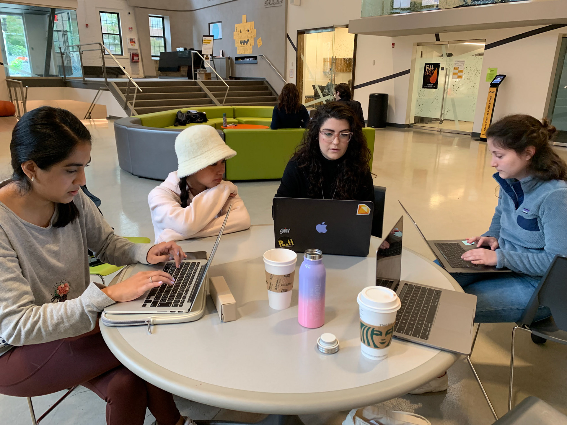
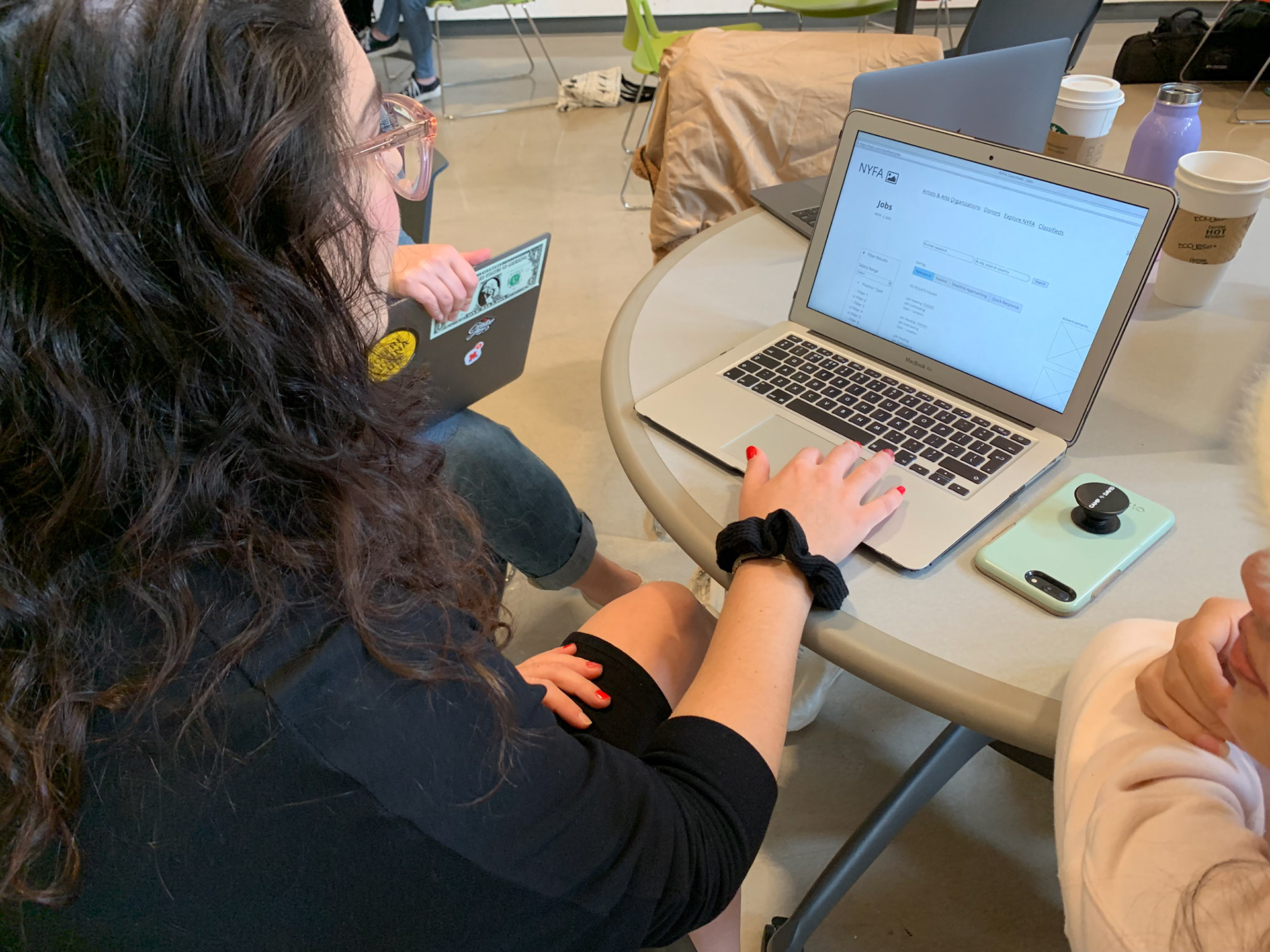
We totally invited 8 female job seekers in NYC who are in the beginning of their career to conduct the research on the current website. The user testing consists of observation and interview.

User interview and observation

User interview and observation
The research focused on:
⦁ What information about the job that users pay the most attention to?
⦁ What filters or sorts users use most often?
⦁ How do users' attitudes toward job listings that were more than two weeks old?
The most important key finding: As long as jobs are relevant enough, users are still interested in applying for the jobs that are posted on the board a few months ago.
Through the finding that I discovered, it became clear that designing "relevance" and "personalization" for the job listing would be a guiding principle for the design going forward.
Competitive analysis
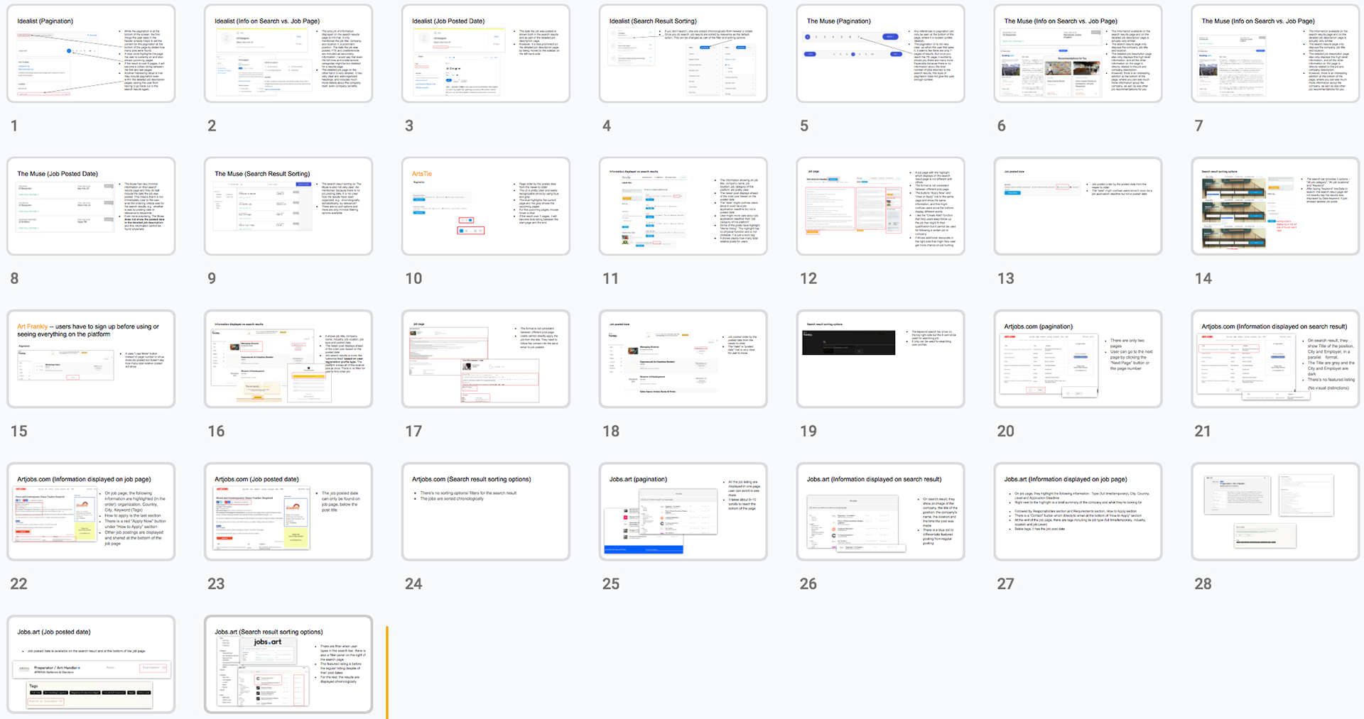
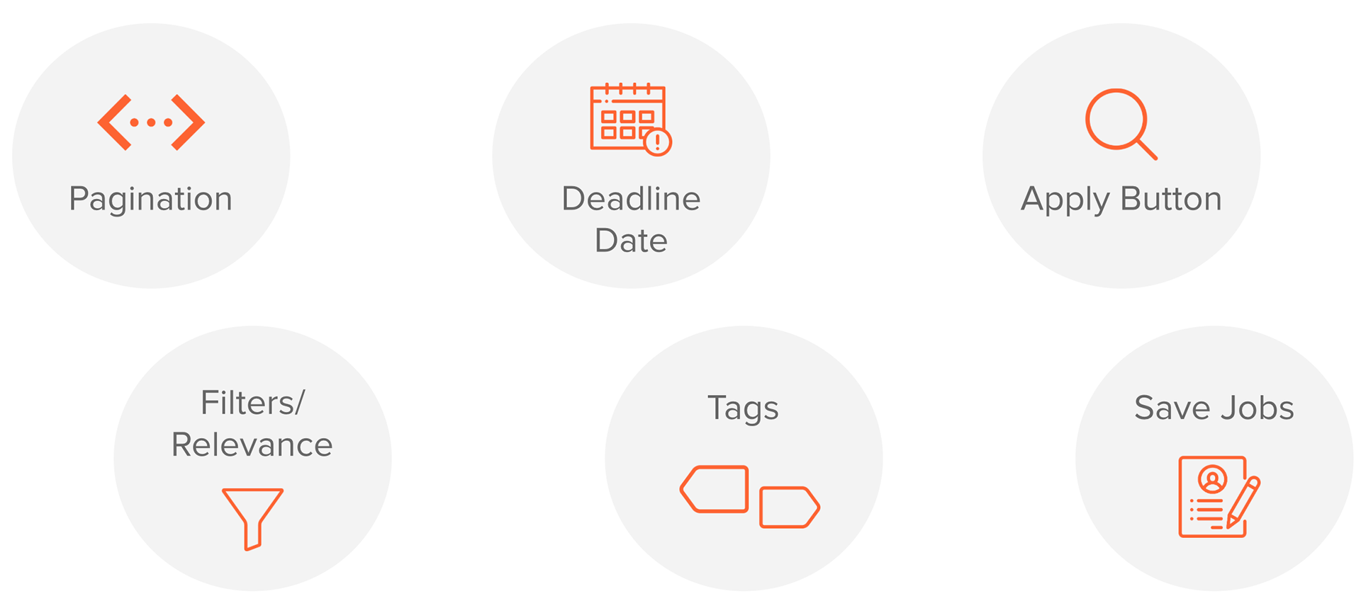
Before jumping into design, I conducted a competitive analysis based on our client needs, analyzing 8 websites from 4 different aspects. Since I want to help users get the most relevant results on their job searching, I defined these 4 aspects are pagination, information displayed on the search results vs. detailed job page, job posted date, and search result sorting.
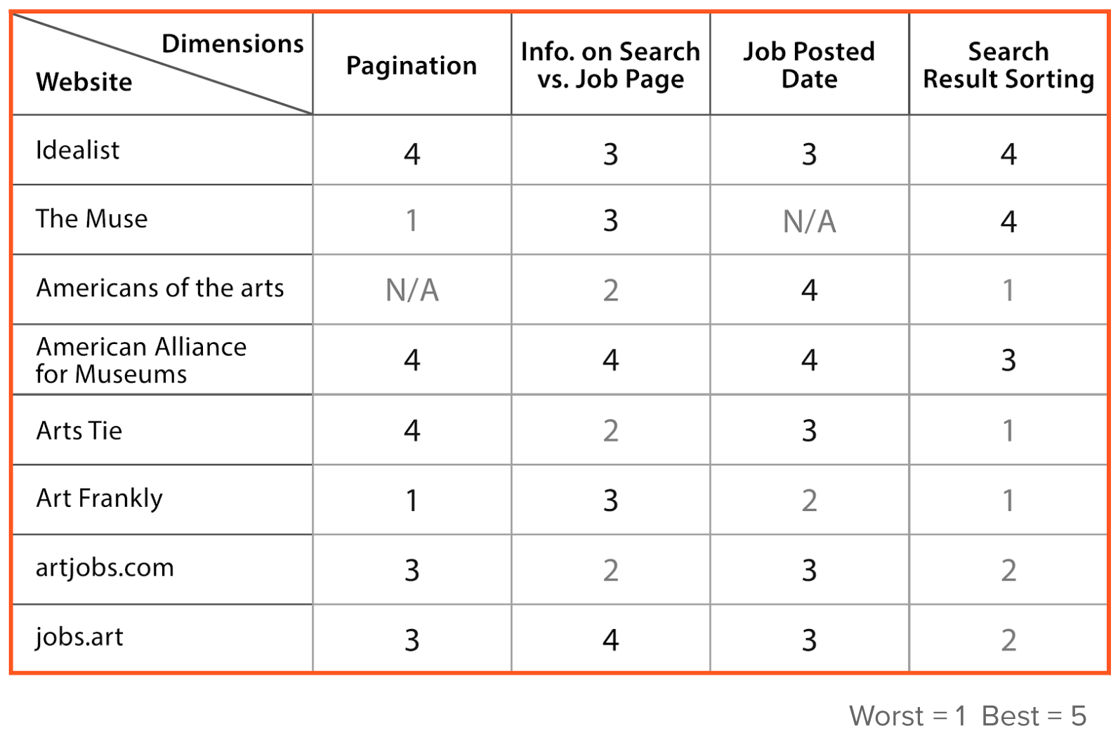
Through the analysis, I learned that:
⦁ Standard pagination patterns are the norm
⦁ Including job post date on the results page is common
⦁ Searching result pages are usually lighter on the job details
⦁ Providing sorting options can give users control over sorting their results
Parallel low-fidelity prototyping
With all the user insights and inspirations, we brainstormed and prioritized the features. Then I wireframed and discussed some ideas with the team about the structure and visual components of the website.
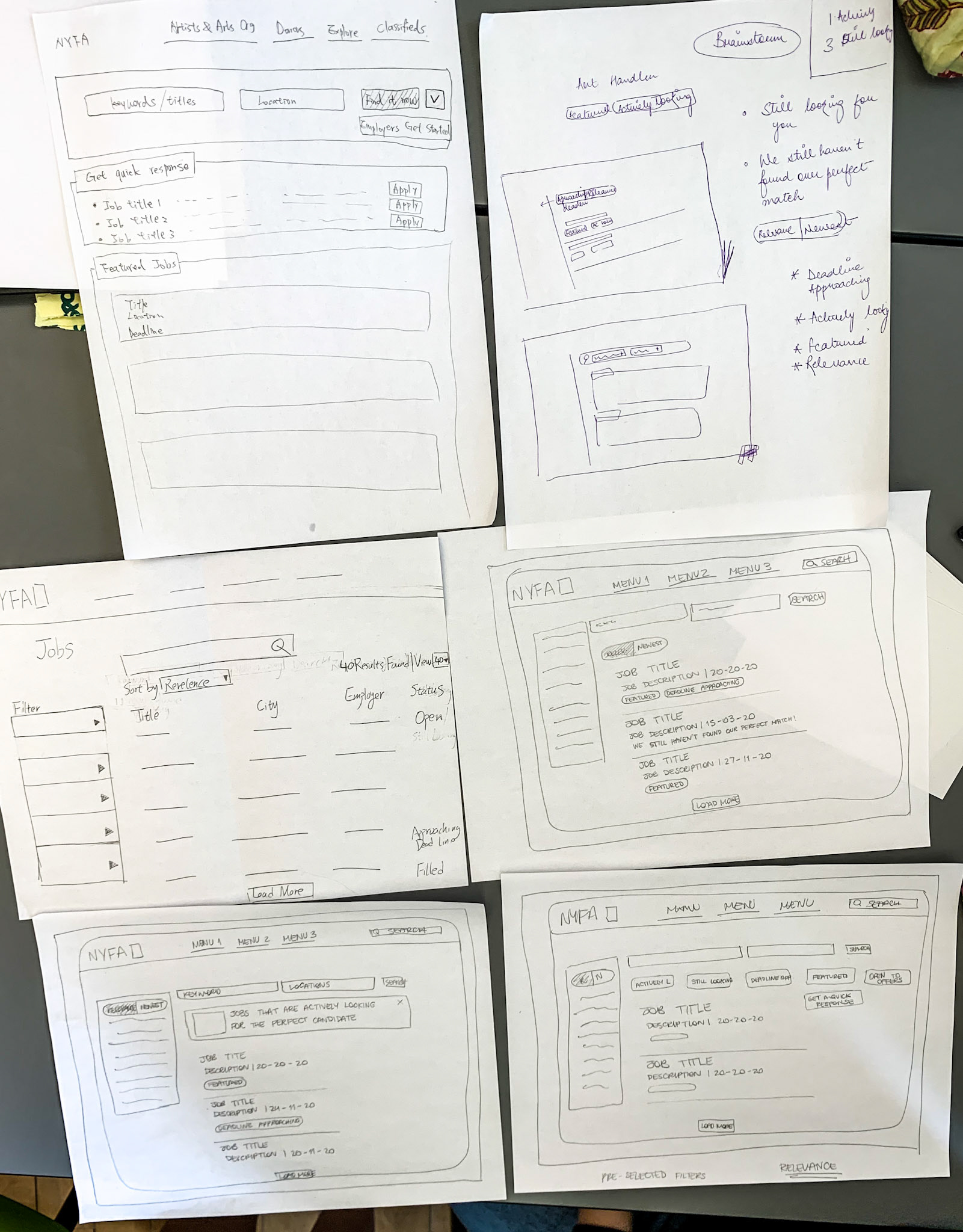
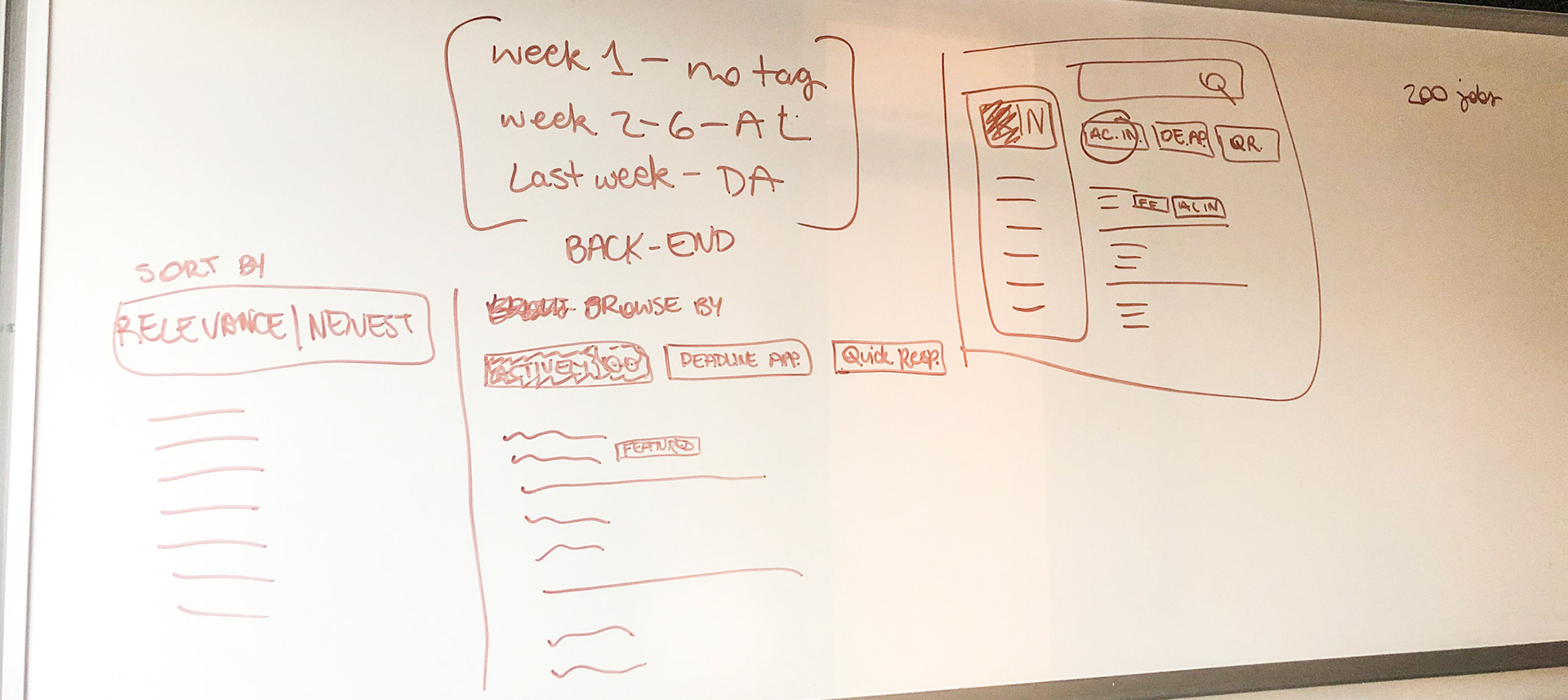
Based on the paper wireframes, I turned our ideas into parallel prototypes with Balsamiq. In addition, I focused to develop sorting and filtering options that would allow users to search the most relevant jobs for them. Also, I reorganized the layout of the existing job detail page to make it clearer.
Some major changes on the website include:

Job listing page version 1
⦁ Apply on job listing page
⦁ Display deadline instead of Post date
⦁ Sort search result by “approaching deadline”
⦁ Pagination on the top
Search page version 2
⦁ Tags for sort by options
⦁ Use scrolling instead of pagination
⦁ Display additional helpful information about the job posting
Job detail page
⦁ Highlight job features
⦁ Show relevance tags which can connect to other posts
⦁ Show similar opportunity
⦁ Post Date on the bottom
Guerrilla testing- A/B testing
User testing
User testing
I conducted A/B testing on our wireframes with 3 out of 7 total users who have an art background and had similar job search experience before. From the testing, I got user feedback regarding 6 aspects below:
#1 Users preferred pagination to continuous scrolling instead of the ‘load more’ button.
#2 Users did find the sort by ‘relevance/newest’ options helpful, but did not find the ‘quick response’ or ‘deadline approaching’ filters especially intuitive.
#3 Users cared more about the job deadline date than the posted date.
#4 Users liked the tags and similar opportunities options in the detailed jobs page.
#5 Very few users said that they would use the Apply button directly on the search results page to apply for a job.
#6 Multiple users mentioned that they would like to have the option to save a job to then apply later.
On-boarding experience
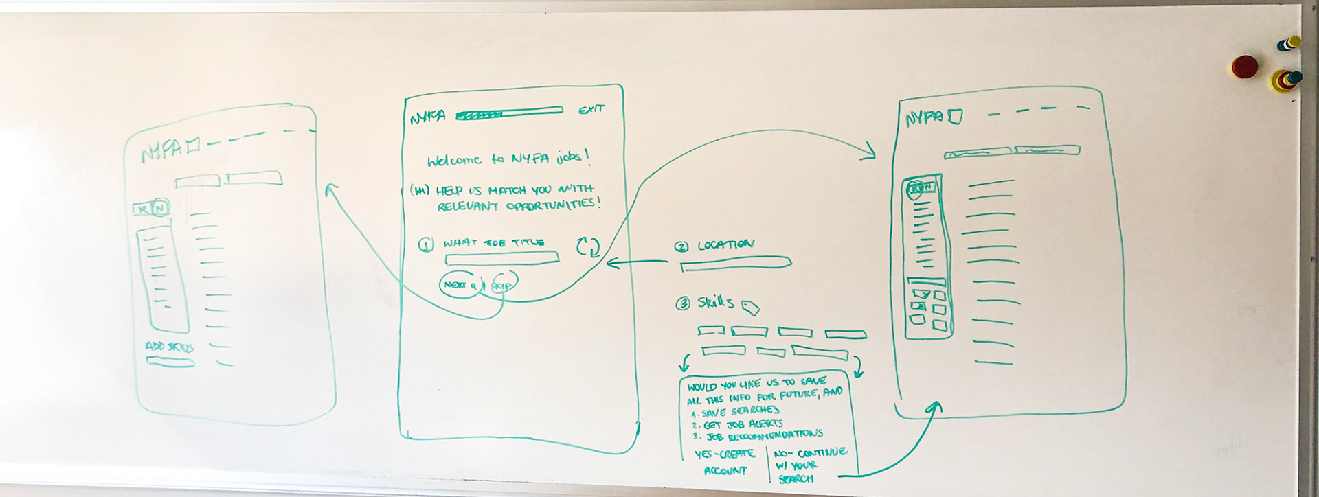
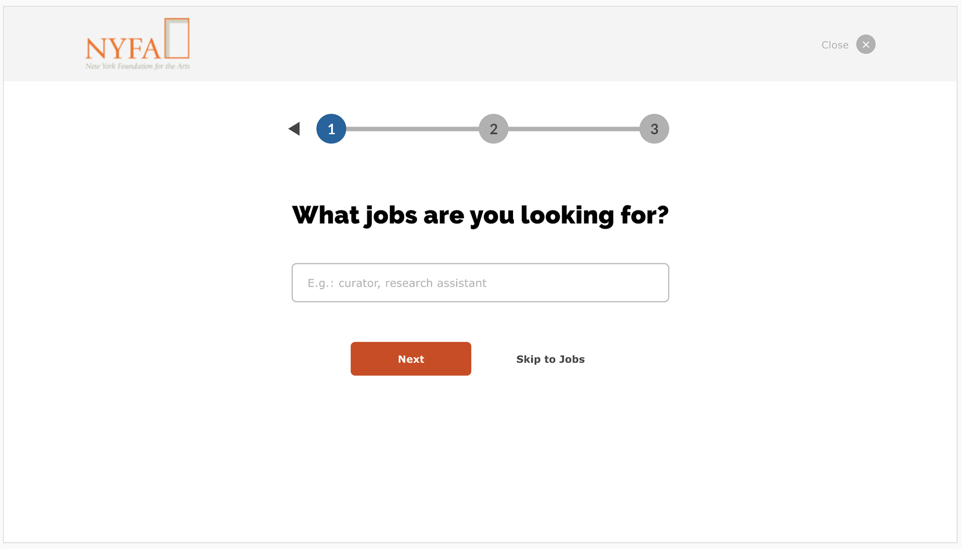
Since most of our feedback indicated that the changes I was proposing were not making significant enough changes to motivate users to find and apply for older jobs, I decided to make a big change to our approach.
Going back to our guiding principle of relevance, I decided to introduce onboarding experience to the job search that would allow users to tell exactly what they were looking for before they even got to the results page.
The initial version-1
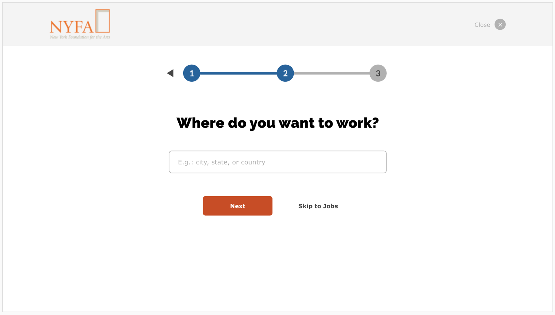
The initial version-2
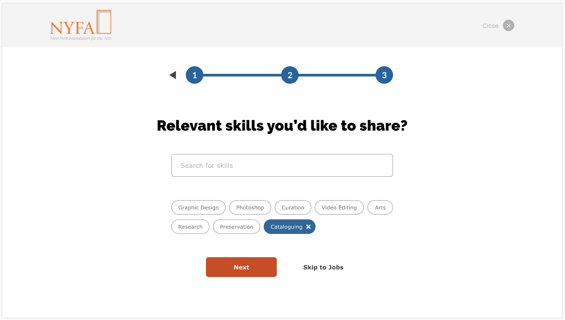
The initial version-3
The initial version-4
Stakeholder feedback
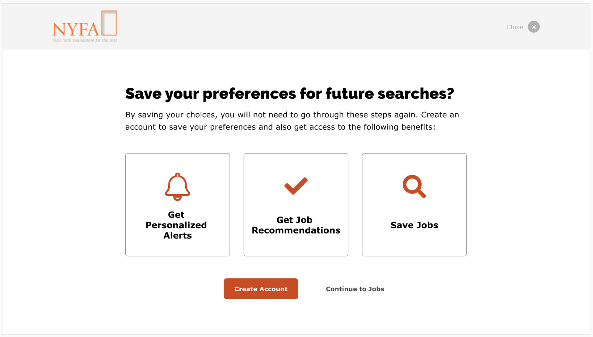
Before going to our high-fi prototype, I hosted the 2nd meeting with the team. I shared the low-fi prototype to stakeholders to gain feedback. They had positive feedback on the overall design, and then gave suggestions of perfecting the details of the on-boarding page. They would like to apply one page instead of four due to the company's capacity. Therefore, the lean version was created for users.
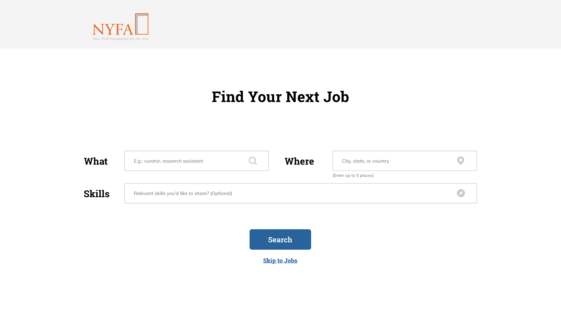
The last version of the on-boarding page
By introducing this on-boarding page before users even see available job listings, NYFA will be able to control what they were shown. This will allow NYFA to eliminate non-relevant results as much as possible. The design provides a more relevant search experience, showing users' personalized results regardless of job posting date, and this also helps users meet the priority which is they will still apply for older jobs if the jobs are relevant to their interests.
Job seekers prototype walkthrough
Afterward, I finalized our prototype based on user and stakeholder feedback. The website displays the on-boarding page to ask users preferences and then provide the most relevant job listings to users based on their preferences.
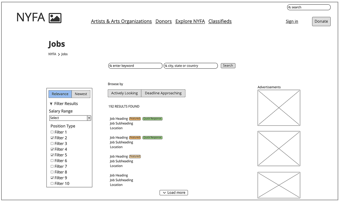
The last version of job seekers platform prototype
On the job listing page, the job listing will be displayed based on the importance of information that the job-seeker values. Users also have options to reset their preferences or add additional requirements to further filter the results.
The last version of the job listing page
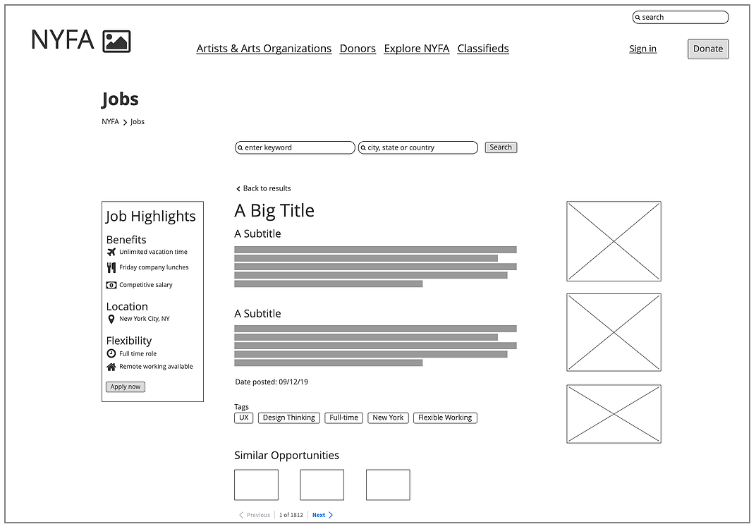
Besides, I divided the description box into a few sections to make the content more efficient and clear to users. Matched skill tags also can help users identify relevant jobs, and users can browse from the detail page through similar opportunities to explore more preference matching jobs.
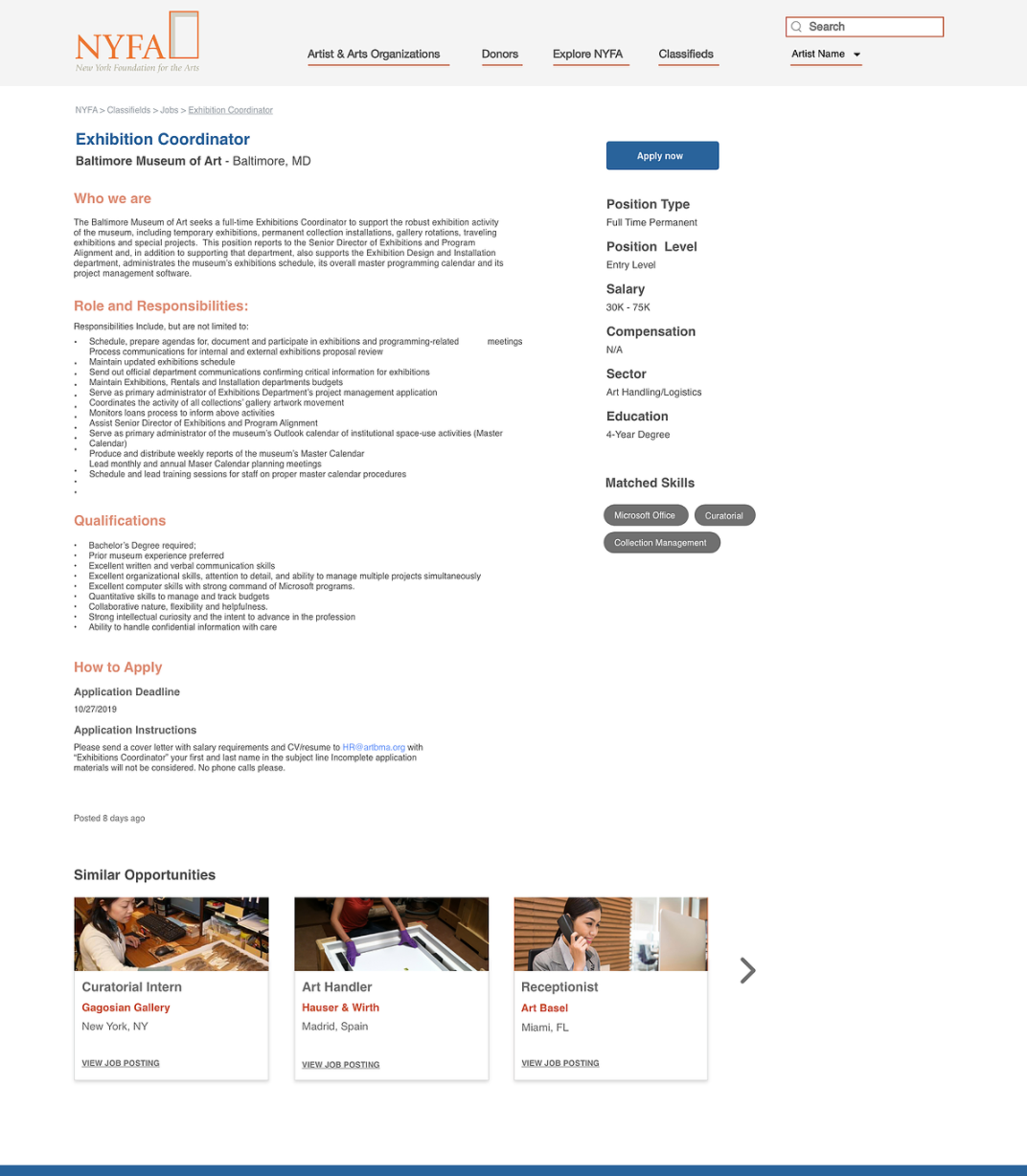
The last version of the job detail page
Design for Track #2
To increase advertising revenue targeting our mission track 2, we started out our research with NYFA staff to understand its loyal customers.
Research for advertiser journey
In order to understand the interactions driving the job posting process between NYFA and its advertisers, we conducted a workshop to create the Service Blueprint with NYFA staff. The Service Blueprint starts off creating an advertiser account to the job listing being live, then expire or position filled.
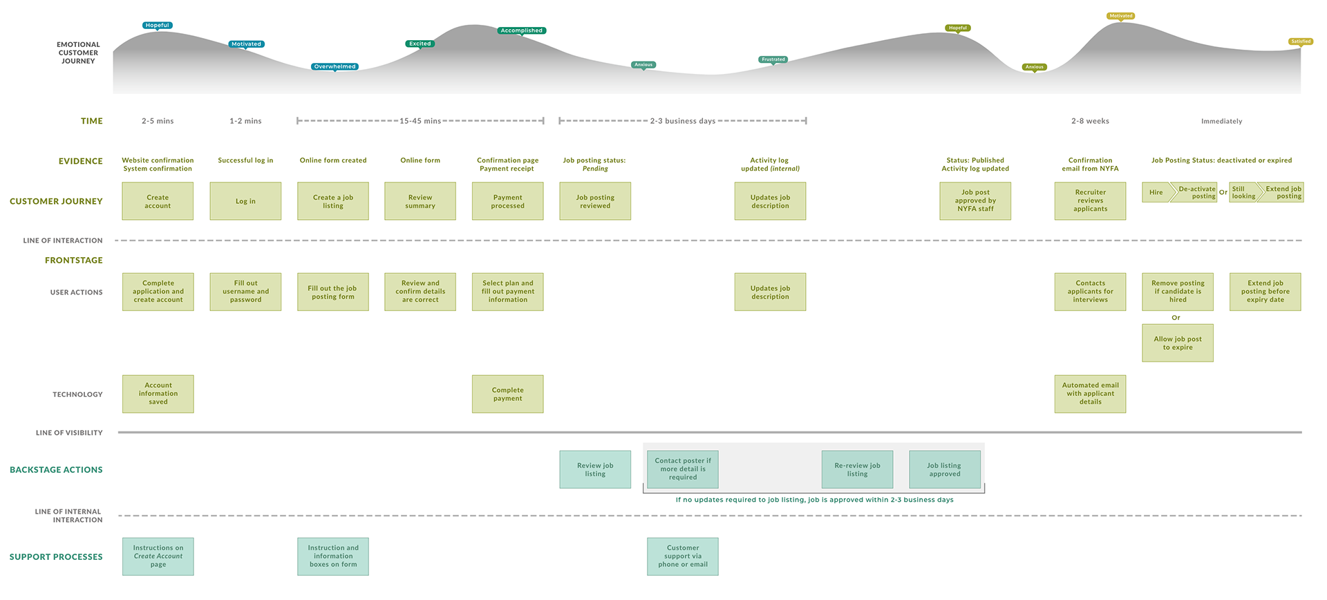
Service Blueprint
Advertiser pain points
Through the Service Blueprint, we were able to further identify the following pain points, which guided our design:
#1 Unmanaged payment expectations
Historic data from NYFA showed that a significant percentage of users left on the payment step of creating a job listing. After a detailed discussion with NYFA staff and an expert walkthrough, we boiled it down to two reasons:
- There was no information about advertising cost prior to creating a job listing
- Advertising cost was presented too late in the process
#2 No awareness of a review process
NYFA has a unique review process for their job listings. They verify the job posts before the posts become live. This process ensures that NYFA carries quality jobs. However, it was frequent that a lot of advertisers, especially new advertisers, were not aware of this process. It led to a bigger input on explanation and follow-ups from the NYFA customer team.
Design iteration-I
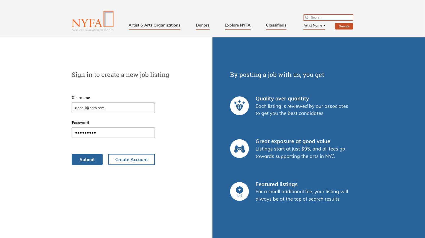
After understanding the advertiser pain points, I designed a quick first iteration of the complete advertisers journey prototype below for later usability testing.

Welcome page
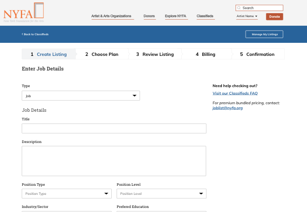
Job post form

Billing page
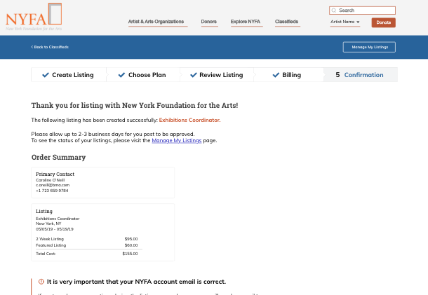
Confirmation page
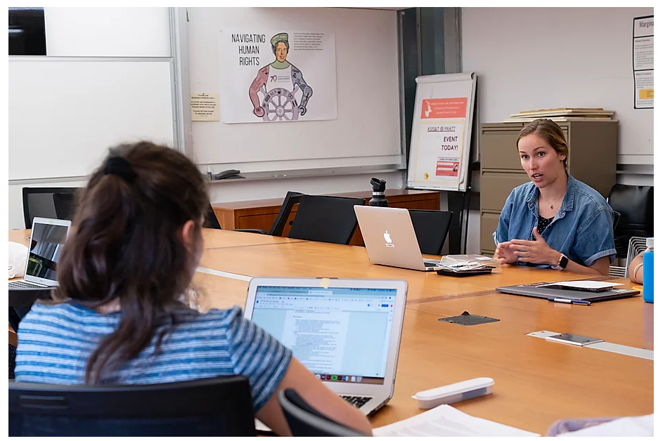
We hosted in-person usability testing with 5 current advertisers to test our prototype at our office. We separated into three groups to have interviews and observations with each advertiser at the same time, sharing the same interview protocol on Rainbow Sheet, which helps us understand how they manage their posts and purchase plans, what factors will affect making decisions, what are the goals they have.
I partnered with another teammate interviewed one of the advertisers who usually hired freelance illustrators to his company through the NYFA current site.
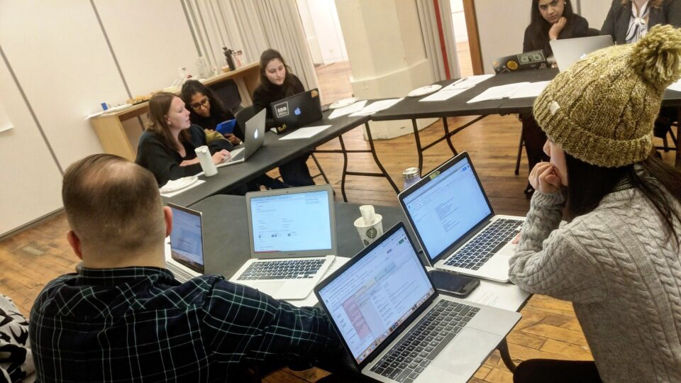
Testing session with advertisers
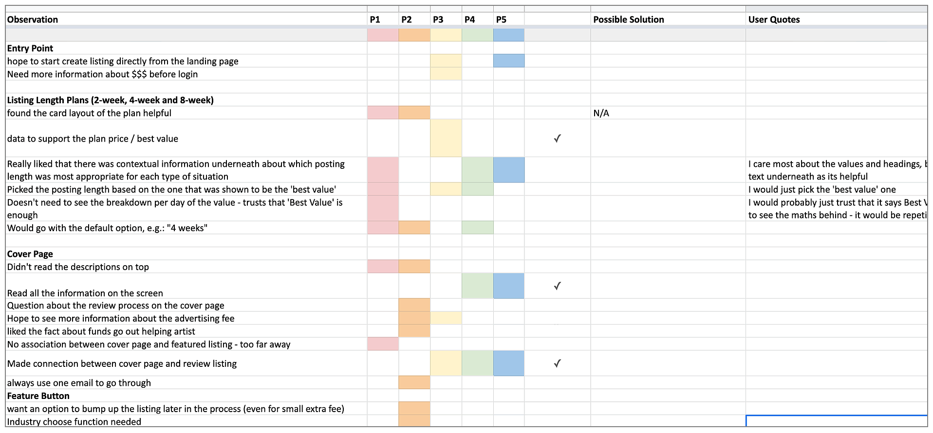
Advertiser feedback consolidation form-- Rainbow Sheet
One of the most important findings from the testing was that: Default option and contexts with the plan make big impacts on advertiser’s decision.
Design iteration-II
Our second iteration incorporated solutions to pain points identified in our blueprint, and feedback from our testing session. Since the default functions and the context planning can be huge factors to affect users' decisions when it comes to advertising their posts, I decided to make the landing page more clear, adjust default settings, redesign layout to make it a more attractive and modern look.
For the current job board, it has no cover page or introduction for users to know how it can work, and this usually leads to surprises with the payment and review process to users.
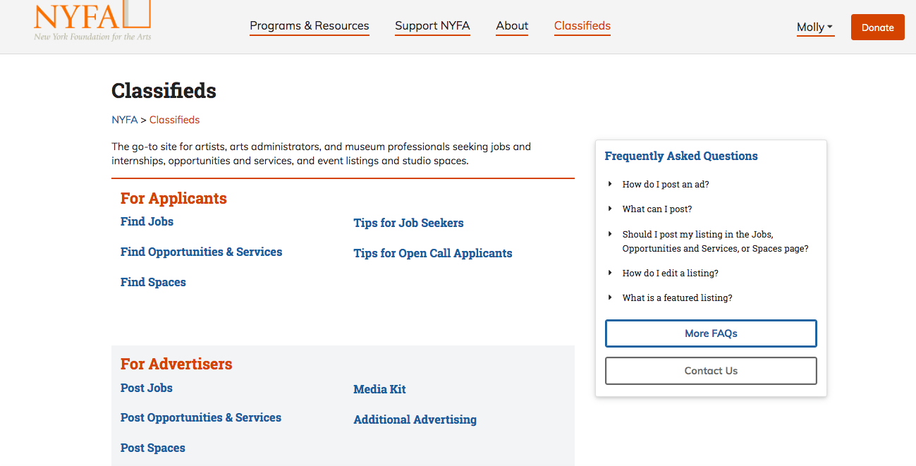
The current job board
After the testing, I designed the introduction content of prefacing posting costs, the posting review process, and the featured listing function based on NYFA marketing approaches on the advertisers' landing page. The layout was refined through the first iteration of our prototype.
The landing page of the second iteration
For the current check out process, the 4 and 6-week posting length plans are hidden behind drop-downs, with no references to their benefits so users may not be aware of it.
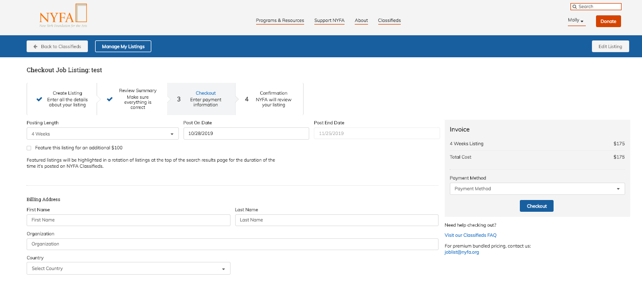
The current check out process
I redesigned the payment layout with another teammate to fully display options of the posting lengths with specific guidelines for users. By surfacing all the posting options, users can make more informed decisions with advice on effectiveness, and this also can help NYFA increase advertising revenue on 4 and 8-week plans that live up to their expectations.
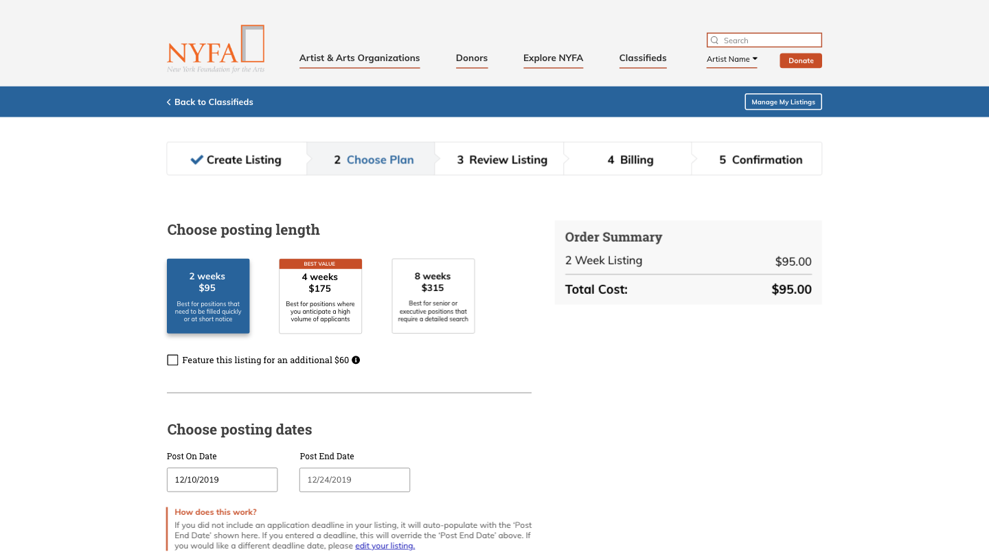
The check out process of the second iteration
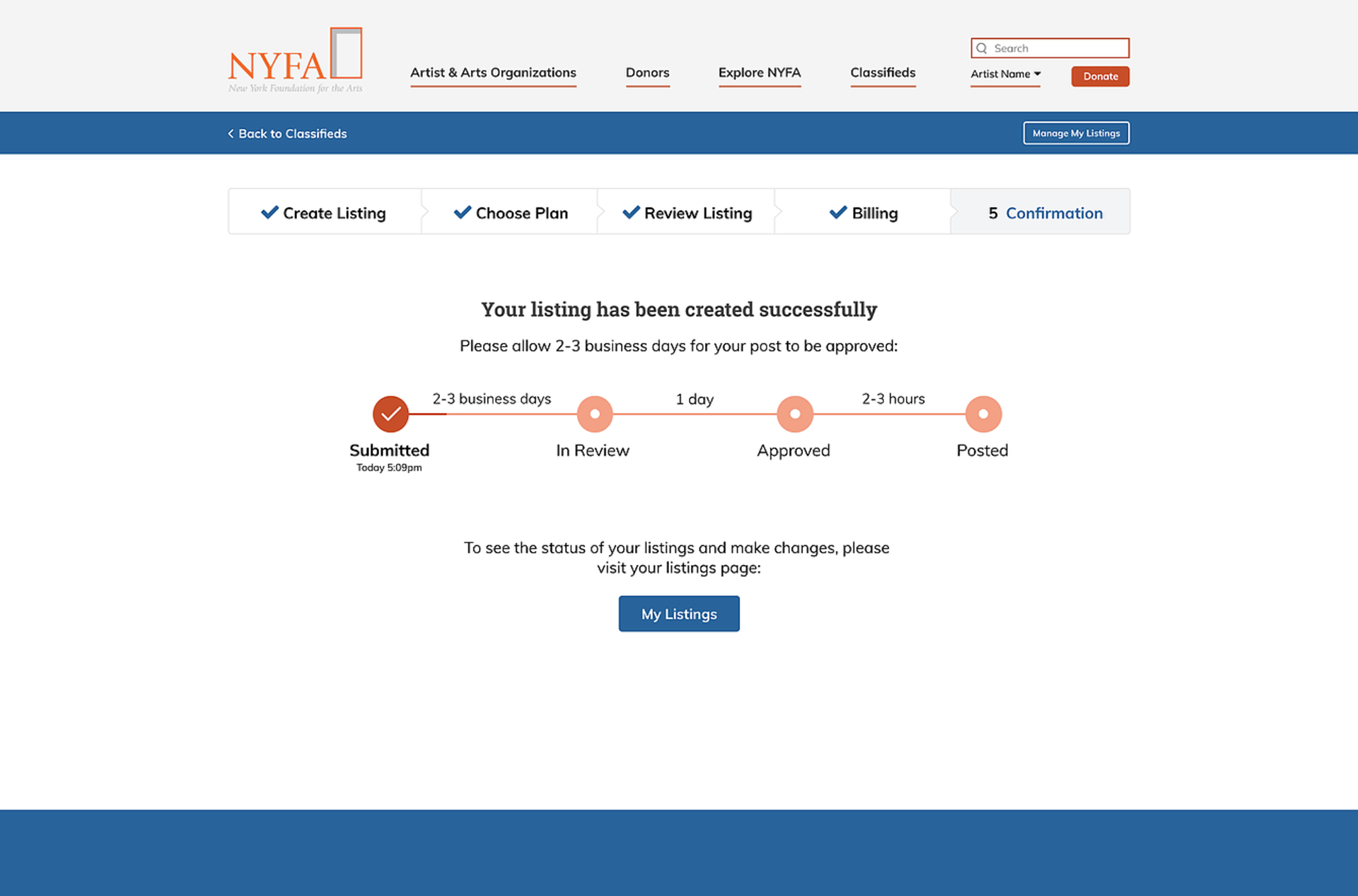
The check out process will show the progress bar at the end of the process to inform users of their application status. It also allows users to know their application will be under review by NYFA staff before going to live. Users can get back to see their status anytime by logging into their accounts.
Advertiser prototype walkthrough
Feedback
At the final meeting, we delivered up-to-date designs and discussed future directions. The stakeholders really satisfy and enjoy the outcome, giving positive feedback to the overall design.
“I felt the team had a consistently deep understanding of our problems, at every stage, which is clearly reflected in the final design.” - Director of Sales and Communications at NYFA

What's Next
After completed the desktop of the job seeker platform, the next step would involve possibilities of mobile versions. Since many job seekers apply for their job anywhere and anytime, creating a responsive mobile website can help users make efficient decisions. I designed the responsive mobile website to explore the initial features for showing how we will build our future version and improvement.
I also defined three possible ways that can help enhance the product in the next few months:
#1 Measure success
In our first workshop, we discussed our success metric as being a minimum 15% increase in the sales of 4 and 8-week job posting ads over a 6-12 month period. NYFA marketing and sales team will be monitoring their analytics results to verify that the goal of our redesign is met.
#2 Use analytics for further improvements
Having data would give future redesigns more direction and help to know how our changes will perform.
#3 Test the initial mobile site of job seeker platform
Conducting the first round user testing for the mobile version will allow us to define the priority problem before we discover or add a new feature.
What I learned
NYFA is one of my favorite projects, where I am so lucky to meet the great team. I designed the interfaces for both job seeker and enterprise advertiser, also for both desktop and possible mobile version. The complicated structure and the intensive process make it a great learning and practice for me.
One of the biggest challenges of the project is to understand how the job market operates. Especially, advertisers are one of the important groups leading the job market, which owns a different conceptual model with specific needs. I’m glad I have been able to leverage research and user journey mapping to understand it and successfully revamped the project, even when the tasks turning to be more and more complicated. Because my role for this project actually expanded after the first few design iteration (I was only tasked to redesign the job listing for job seeker users at the beginning).
User testing is another part of the projects that I learned a lot. No matter how good the skill is, designers should always go out and talk to other people, so that we can avoid as many blind spots as we can. I’m planning to conduct more user testing and perfect the design when going forward and looking forward to making the product one of the best in its categories.