About Project
Teammate Marketing, Design, PM Team | My Role Design Lead for UX and UI with Front-End Development, Usability Specialist | Duration 2 years
The goal of this project is to help increase active users and improve membership experience of an international department store by enhancing emailing experience.
To comply with my non-disclosure agreement, I have omitted confidential information in this case study. All information in this case study does not reflect the views of Isetan Mitsukoshi holdings Ltd. and Shin Kong Mitsukoshi Department Store.
Background
Isetan Mitsukoshi holdings Ltd. in Japan has the largest department store chain "Shin Kong Mitsukoshi department store (SKM)" in Taiwan. As the online traffic have reached tens of thousands, SKM have begun planning to enhance online consumer experience. To deliver better customer experience, the company was planning to spend 2 years for preparing launch the largest B2C (Business-to-Consumer) online shopping platform in Taiwan in 2016 for customers in Asia.
Before launching the B2C online shopping platform, the company pays more attention to their online customers and tries to enhance customer loyalty and develop great user experience for supporting better shopping journey. The company delivered emails to different memberships based on different member lists. The e-newsletters could be divided into five types -- Annual events, seasonal events, art and new trends weekly events, VIP events, and other enterprise partners' events. The circulation of each e-paper could reach 1,100,000 —2,500,000 in total. Our team aimed at improving customer experience on e-mail marketing to help different customers in decision-making and connect to the department store from online to offline.
My Role
Before starting the project, I had collected web data weekly for mobile and desktop from the official website and fan sites by using Google Analytics and Facebook Page Insights, and reported e-newsletter data twice a week from the internal system for the long-term user behavior observation. I also lead the team to conduct user testing with 43 participants to find user pain points. Through the findings, I spearheaded the UX general direction of e-newsletters for 3 priorities:
⦁ Establish valuable and curious contents to foster readers to open emails
⦁ Redefine visual styling elements for maintaining consistency
⦁ Redesign the user interaction system to improve ease of use

Ideation discussion
Ideation discussion
Ideation discussion
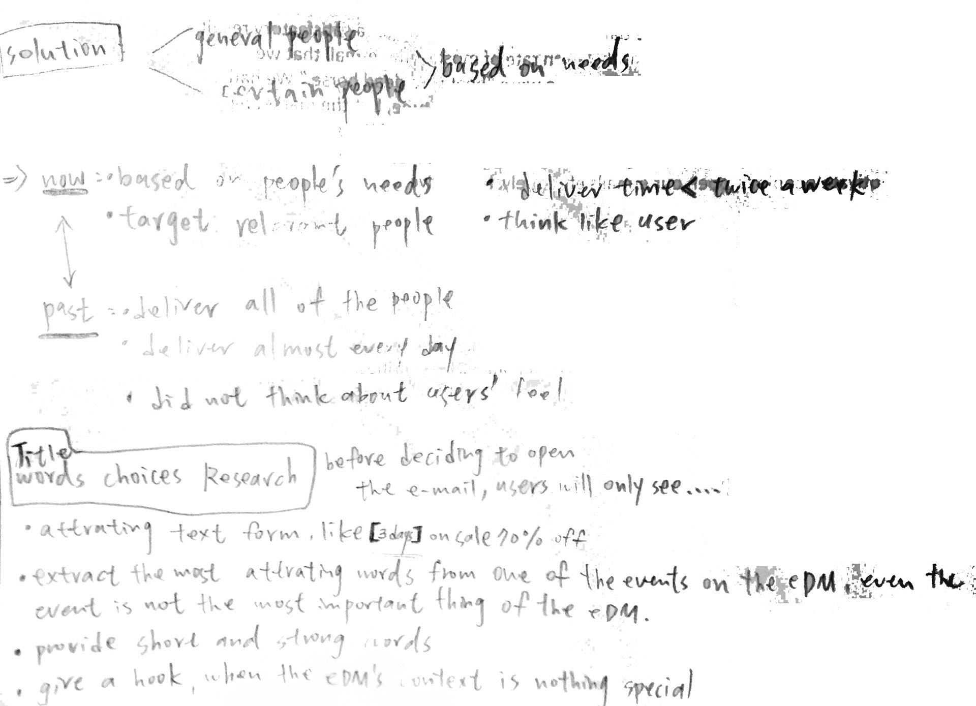
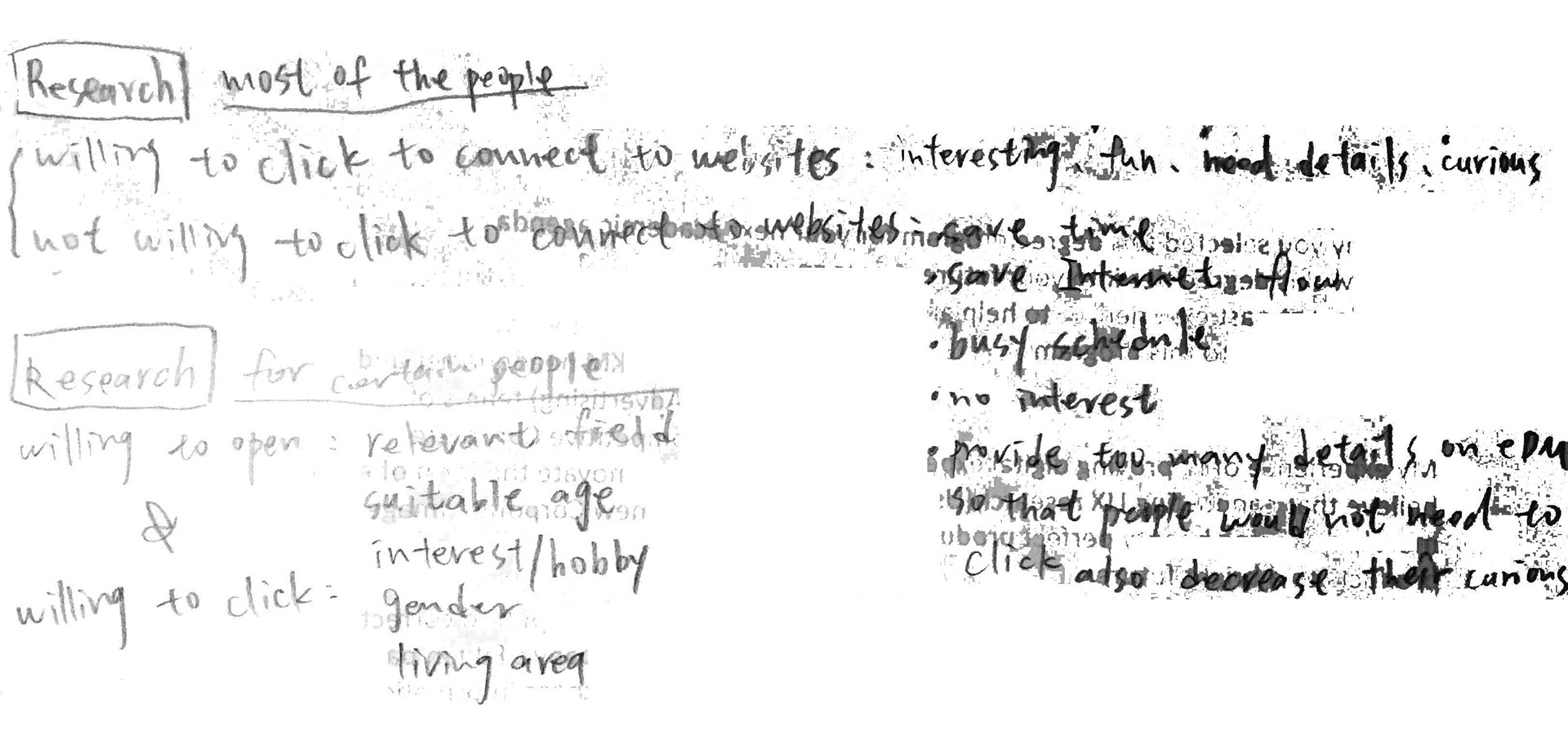
Part 1: Motivating Users to Open Emails
The problem
Although the circulation of each e-paper can reach to 1,100,000 —2,500,000 in total, the open rates were quite lower than that number. If people receive an e-newsletter but do not open it, we can assume this email is invalid since they do not really get the important information from the content. In other words, the company did not actually reach that many people, even though they have a large circulation.
After going through the existing implementation and understanding the user findings from Marketing Department, I highlighted 3 issues that might cause users to lost their interests in opening emails:
⦁ High and random sending frequency would cause a negative effect. People might not get attention but were annoyed by e-flyers showing up in their email box more than three times a week
⦁ User received e-newsletters with not consistent sender names. Sender names of subsidiaries were not systematic even through they were under the same company. Users cannot easily recognized who sent the email and would report it as a spam
⦁ A long text email subject caused readers lost their attention. They were difficult to absorb huge information in 0.5 — 1 second that most of the people spent their time on browsing email titles in the inbox list
Design attractable signs
After several rounds of feedback from stakeholders, I proposed 4 solutions as follows:
⦁ Set up fixed sending intervals to different types of the e-newsletter that should not be sent more than twice a week. If the same type of the e-newsletter have to be sent twice in a week, it should be contained different subjects and contents from one another to avoid readers losing their patience
⦁ To improve the recognition, maintaining a consistent brand image is the basic principle to the company. Using a series of consistent sender names can be clearly identified by readers
⦁ Design email subjects in a concise, clear and descriptive way. For example, the email subject can start with the symbol【Theme】or emoji that used for highlighting the most important promotion and the total word counts should be no more than 40 words
⦁ In order to meet users' expectation, the email subject and the content of the first section of the e-paper should be coherent
Part 2: Visual Elements Revision
The problem
The visual styling was outdated which cannot help make the great image of the company. In addition, it was not mobile friendly for users. The fonts were too small to read and some pictures were fuzzy and deformed.
Redefine layout styling
Here are 6 solutions I proposed for general visual design that help ensure user-friendly for mobile and desktop consistency:
⦁ Using high quality of pictures instead of a huge block of texts in e-newsletters
⦁ General content text is in a minimum of 10 points font with line spacing set at a maximum of 3 points
⦁ An entire e-newsletter can only contain a maximum of 4 banner areas with clear pictures (72ppi above) and texts
⦁ Each of banner sizes defines as width 600 with height 1,000-1500 pixels
⦁ Contain the same position of the header and the footer with the company's logo and statement
⦁ Follow by the Taiwanese government rule that advertisements containing alcohol products should show warning signs


Part 3: Enhancing User Interaction
The problem
Users often lost in their journeys since some of the e-papers had uncompleted interaction systems or unclear user flows. For example, some of the contents did not embed correct URLs that could lead users to the pages on the official website which been expected to cohere to the e-paper contents. Others did not show button signs on the user interface to tell users where could be clicked for entry.
Redesign interaction system with front-end techniques
⦁ For building better user flow, each content of a section needs to embed an valid URL linking to a certain page of a website. The banner is like a signboard and the webpage is like a destination for users. The URL can become a channel to access between the e-flyer interface and the online shopping platform to prevent user from got lost
⦁ Put the button icon in an obvious position of the e-paper or make the icon more visible than other visual elements in order to attract users' attention to lead them to the website which contains more detail information
Rapid prototyping
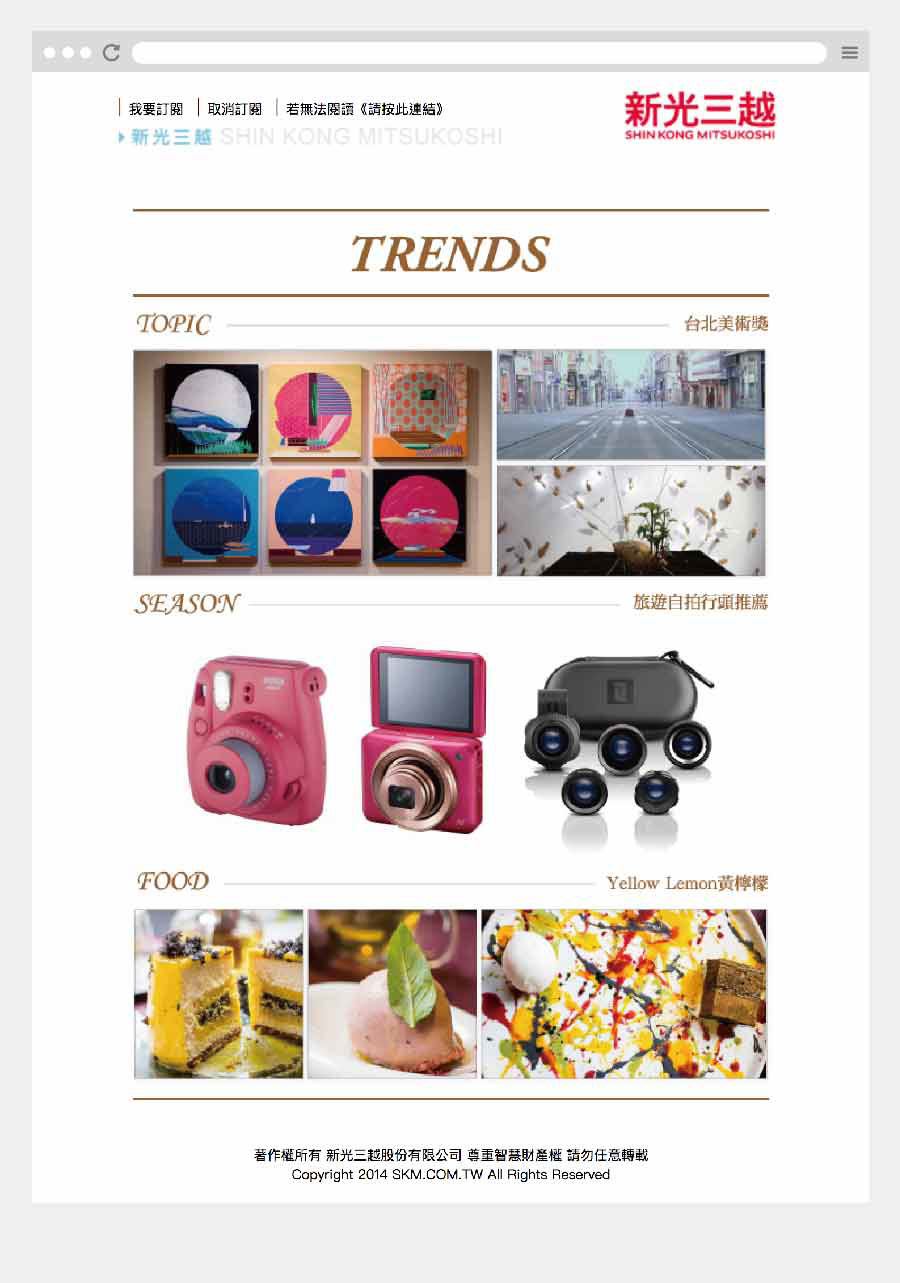
Analyzing Real Examples Before & After Improvement
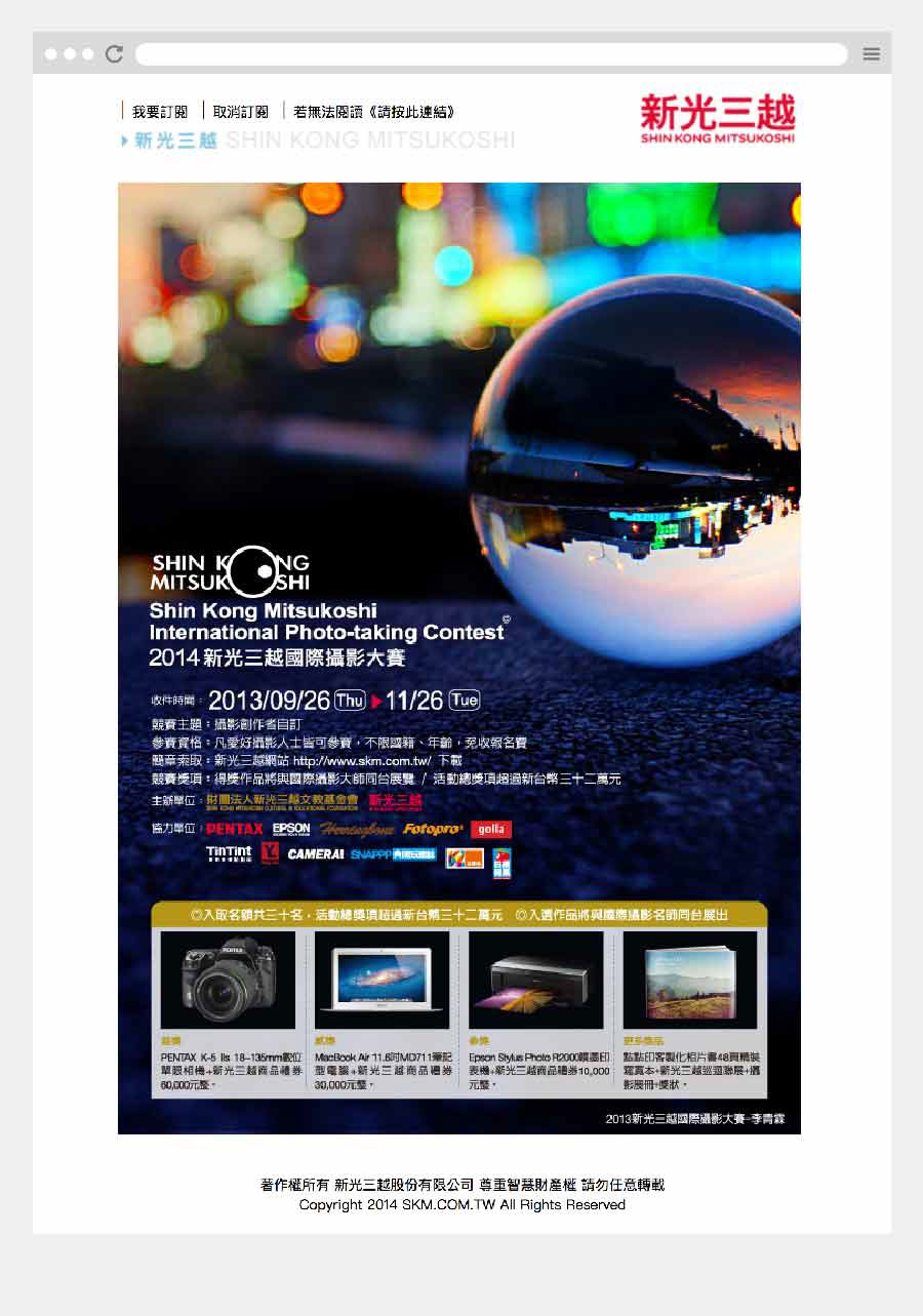
I select 2 example of VIP events catalogue from hundreds of thousands of existing e-newsletters. Both e-newsletters contain VIP benefits, events, and special discounts that offer to VIP members only.
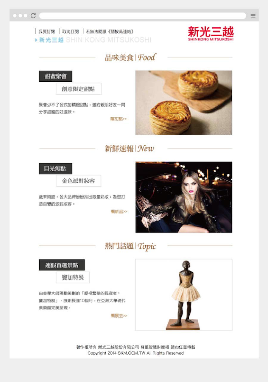
Before improvement

Here are some pain points for this old version:
⦁ Although the first area designed with the "Top News" label takes the picture as the major layout, and the texts are the minor, the e-newsletter containing so many messages without coherence makes this area hard to read
⦁ Due to the first area does not show consistent coherence, the readers would not be motivated to click on the banner since they cannot aware. The users feel confused about the results after clicking, and they also feel hesitated about wasting time to click the banner
⦁ The e-newsletter is not user-friendly for mobile users since it contains too much information with several small blocks that makes users hard to access
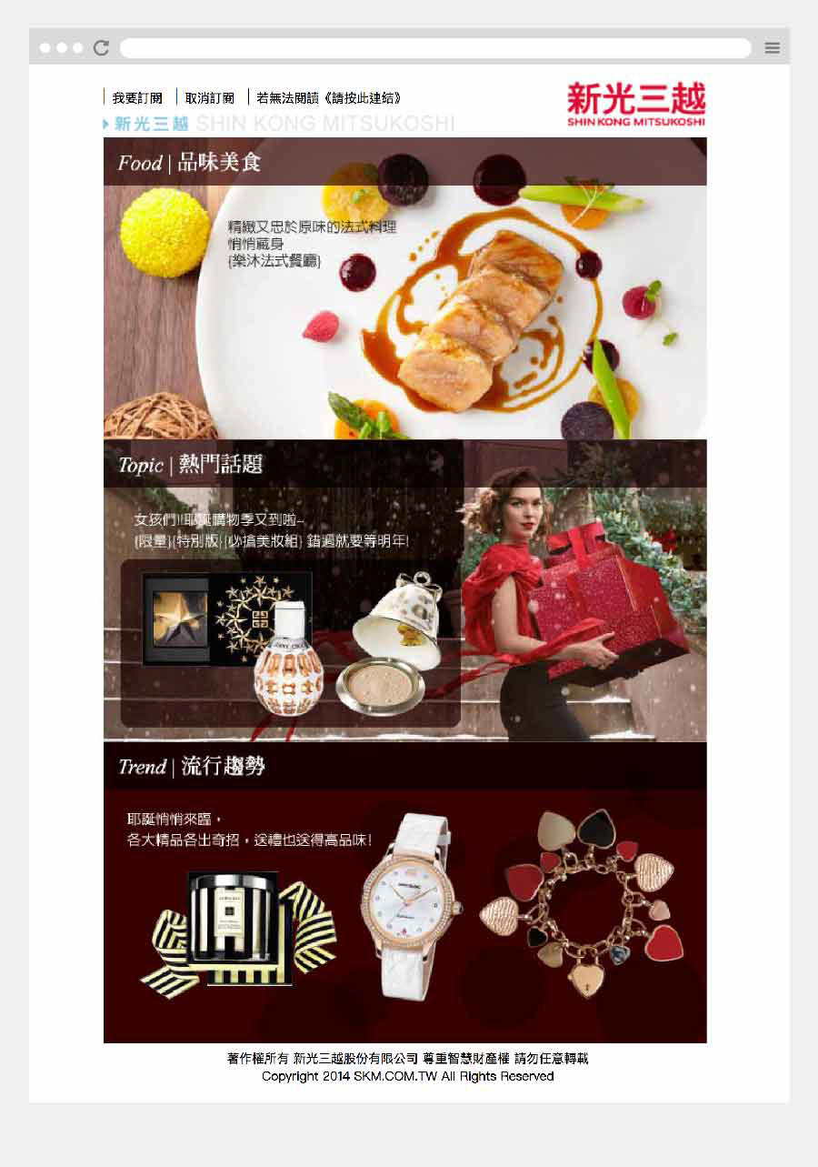
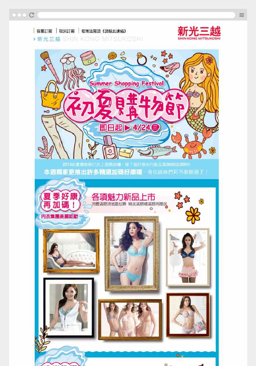
After improvement
After combining design solutions which I proposed, I launched a new version of e-newsletter with clearer and organized information format that can help users save more time and find what they need.
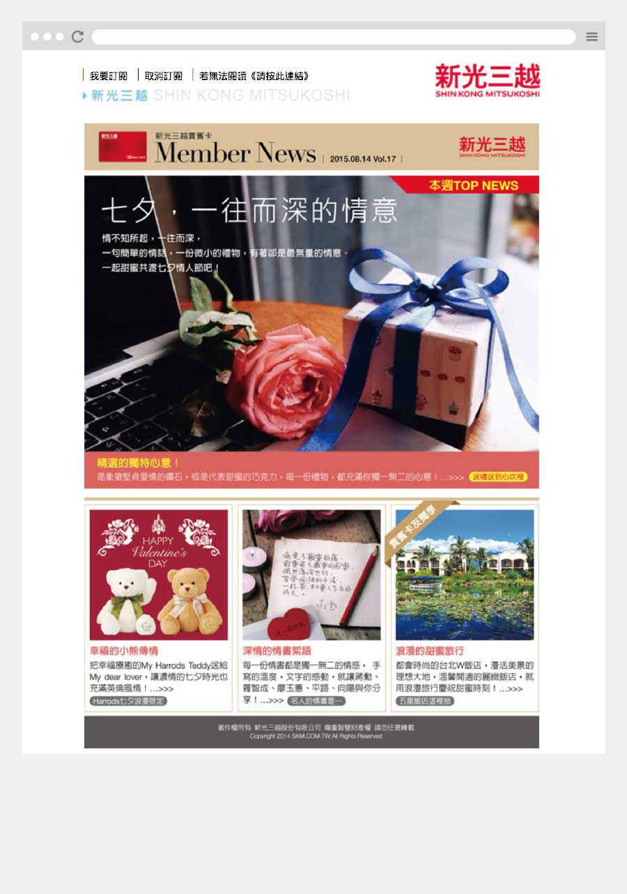
⦁ The features of the four block areas appear unified with each other
⦁ The readers can quickly find the content they need and “click hesitation” has been reduced
⦁ The readers can quickly find the content they need and “click hesitation” has been reduced
The Impact
We effectively enhanced the e-newsletters' open rate and the click-through rate, and the traffic of the websites which included the official website and fan sites. The number of active users has been successfully increased from 700k to 1500k+, as business goals.